A couple weeks ago we described how to create Excel charts with VBA. If you recall, we said scatter plots are a bit different from most other chart types. In this tutorial, we will take an in-depth look at how scatter plots are different and how you can control them using VBA in Excel. More importantly, we’ll demonstrate why controlling a scatter plot with VBA can be so powerful.
To demonstrate VBA scatter plot control in this tutorial, we’re going to use nominal GDP, national population, and mobile phone ownership data. The data is somewhat asynchronous, especially as the mobile phone data was gathered in the 2010s - a decade of rapid growth in mobile. Nevertheless, it is sufficient for illustration purposes and it’ll be a fun example.
For convenience, we’ve extracted all our sample data and placed it in a CSV file for you. Just download the file and open it in Excel, so it looks like this:
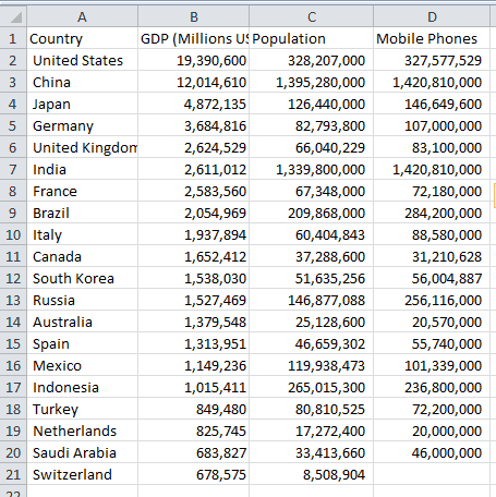
Once your file’s open, you can save it in an Excel .xlsm format, if you want to keep your work.
- Excel Scatter Plots
- Creating a Scatter Plot with VBA
- Choosing the Data
- Data Labels
- Higher Dimensional Information
- Conclusion
Excel Scatter Plots
In our automating Excel charts with VBA tutorial, we talked about switching the axes between horizontal and vertical, and we mentioned scatter plot axes don’t behave the same. Scatter plots have a numerical (or date) value for both axes, whereas most other charts have a numerical axis and a categorical axis (like a country or department name).
Introduction to Correlation
Scatter plots are great for comparing how two variables relate to each other, since we can quickly see whether correlation exists between them or not. If the datapoints move left and upward, we can assume larger values of Variable X usually indicate larger values of Variable Y. This is positive correlation. On the other hand, if they move left and down, it is a negative correlation. The larger one value is, the smaller the other value is.
Sometimes the datapoints are just randomly scattered around and we have no correlation. This is still valuable knowledge!
You may even find your clustering in your data, where datapoints are grouped together with empty space between the groupings.
By adding your data to scatter plots, all these correlations become immediately noticeable without you having to perform any mathematical correlation functions. This is why scatter plots are so useful for answering data questions in all sorts of fields - from engineering to medicine to business.
Creating a Scatter Plot with VBA
The following code block will create a small chart and immediately convert it to an XY-scatter chart. You won’t be able to tell it’s a scatter plot since we haven’t given it any data, but you’ll notice we explicitly changed the ChartType to xlXYScatter.
Sub generate_scatterplot()
Dim ochartObj As ChartObject
Dim oChart As Chart

Set ochartObj = ActiveSheet.ChartObjects.Add(Top:=10, Left:=325, Width:=600, Height:=300)
Set oChart = ochartObj.Chart
oChart.ChartType = xlXYScatter

End Sub
Make powerful macros with our free VBA Developer Kit This is actually pretty neat. If you have trouble understanding or remembering it, our free VBA Developer Kit can help. It’s loaded with VBA shortcuts to help you make your own macros like this one - we’ll send a copy, along with our Big Book of Excel VBA Macros, to your email address below.
Again, this macro will generate a blank chart on the current sheet, change its type to a scatter plot (or xlXYScatter type in VBA-speak), and store the chart object in the variable .Add statement to move the chart around and resize it.
If you end the macro and need to set your
Set oChart = ActiveSheet.ChartObjects(1).ChartThis short VBA snippet assumes the first chart object you have on the sheet is the scatter chart you want to access. Of course, if you have others, you can simply change the ChartObjects index to another integer.
Smooth, Lines, or Markers Only
There are three fundamental scatter plot choices. These three scatter chart types can be specified using the ChartType property:
xlXYScatterxlXYScatterLinesxlXYScatterSmooth
The last two types also have a “no markers” option: xlXYScatterSmoothNoMarkers and xlXYScatterSmoothNoMarkers. Markers are the symbols that appear at each point.
Scatter plots with Lines have straight, jagged lines between the points, while Smooth types allow Excel to approximate a smoothly-curving line between the data points. That way you won’t have sharp changes in direction in your plot. Regular scatter plots only have points with no lines connecting them. For our data (and most data), it is useful to use scatter plots without lines.
If we have data that is always decreasing or increasing for each iteration, lines can be useful but they’re rarely necessary.
In our dataset, some countries have big GDPs and small populations or big populations and smaller GDPs. If we connected our data with lines, we would see a bunch of confusing intersecting lines.
Choosing the Data
There are two ways to assign data to a scatter plot using VBA: (1) the simple way and (2) the targeted, granular way.
The simple way uses the first (left-most column) variable as the horizontal axis and subsequent columns as vertical axis variables, like this:
oChart.SetSourceData source:= Range("B2:D21")This method will automatically add multiple series to our scatter plot and will populate our blank chart like the one shown here:
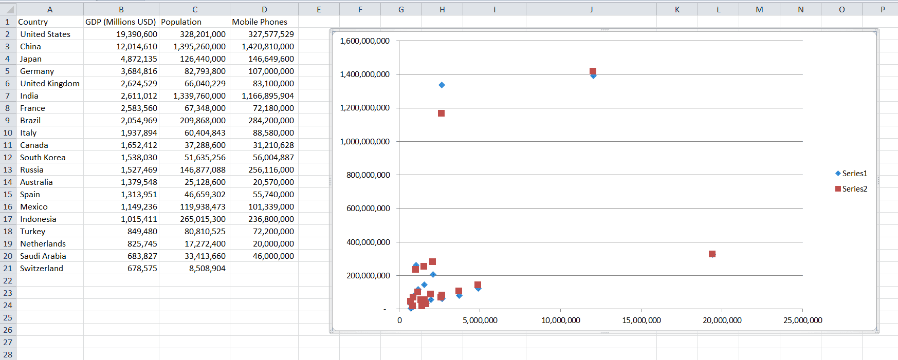
Basic Scatter plot with GDP on the horizontal and population or mobile phone data on the vertical axis
Notice the first series shows the GDP vs. Population relationship and the second series shows the GDP vs. Mobile Phone relationship. Since GDP was in the first column in our range,
It is somewhat natural to use the horizontal axis as the independent variable, but intuitively population seems less reliant on GDP than GDP is on population. Normally we do use the horizontal axis as the more independent variable, but it is not mandatory, and this chart illustrates that fact.
The XValues and Values Properties
There is a second way to define our data. This method gives you a lot more control over your scatter charts. Since we only have three columns of data, we don’t necessarily need more control but there are many situations where you would want this level of control. In our data, we have a GDP vs. Population relationship and a GDP vs. Mobile Phone relationship. Both use GDP as the base, but imagine if we had more columns of data to plot.
If we had several columns of data, we might want to use different data for the x-axis and different data for the y-axis for each grouping, like GDP vs. Population, Phones vs. Cars, and Internet Subscribers vs. Emissions. The XValues and Values properties let you control the plotted axes individually.
Note: If you have several series with different relationships, you will probably need to scale them or place similar data sizes on the primary axis and other similar data on the secondary axis. Otherwise, you might end up with clustered results you won’t be able to draw any conclusions from.
Since the magnitude of country population and mobile subscribers are similar, let’s set our plotted data with those two as the base and GDP as the y-variable.
oChart.SeriesCollection(1).XValues = Range("C2:C21")
oChart.SeriesCollection(1).Values = Range("B2:B21")
oChart.SeriesCollection(2).XValues = Range("D2:D21")
oChart.SeriesCollection(2).Values = Range("B2:B21")
These lines of code will only work if you’ve already added 2 series of data.
XValues are the horizontal axis numerical data and Values are the vertical axis numerical data. The two properties should always be specified in pairs. The integer in the SeriesCollection represents which series of data you’re trying to control. When you run the code, your chart will look like this:
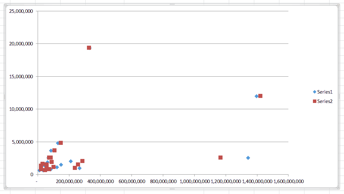
Scatter plot with population and mobile phones on the horizontal axis and GDP on the vertical axis
Adding and Deleting Series
The SeriesCollection object is our two-columned series of data. If you want to add another series after creating your chart, use a snippet like this:
oChart.SeriesCollection.Add Source:=Range("B2:B21")This VBA code will add a 3rd series in our example and it will set our range XValues. Excel will guess that we want to use Values range. It will guess differently based on the scale of your data, so it’s a good idea to adjust both the XValues and Values manually after adding a series.
oChart.SeriesCollection(3).XValues = Range("D2:D21")
oChart.SeriesCollection(3).Values = Range("B2:B21")
Deleting a series follows a similar syntax:
oChart.SeriesCollection(3).DeleteThis will simply delete the third series we just created on our chart.
Data Labels
Let’s continue with a chart that only shows the GDP vs. Population relationship. To do that, we’ll delete SeriesCollection(2), which graphed the GDP vs. Mobile Phone Relationship. Let’s also remove the United States, China, and India from our data since their populations and GDPs are outliers and crush most of our points into the bottom left corner.
While we’re at it, let’s make sure the axes of our first series are displayed the way we want them by using this code:
oChart.SeriesCollection(1).XValues = Range("B2:B21")
oChart.SeriesCollection(1).Values = Range("C2:C21")
After making these changes, our chart and data should look like this:

Chart and Data for Most of the Top 20 GDP/Population countries, with outliers removed
Labeling the Axes
Up until now, you’ve probably noticed we don’t have a quick way to know what we’re actually plotting. Titles for our axes would help us out a lot. To give the axes labels, we would just set the chart AxisTitle captions.
oChart.Axes(xlCategory).HasTitle = True
oChart.Axes(xlCategory).AxisTitle.Caption = "GDP in Millions of USD"
oChart.Axes(xlValue).HasTitle = True
oChart.Axes(xlValue).AxisTitle.Caption = "Population"
You can also set the AxisTitle captions equal to a value stored in a particular cell, if you prefer.
oChart.Axes(xlValue).AxisTitle.Caption = Range("C1")Labeling the Data Points
Currently we just have a bunch of diamonds but no idea which diamond goes with which country. This is fine if you simply want to identify trends in your data, but you could label the datapoints to make each displayed datapoint more meaningful to your end user. Add the line
oChart.SeriesCollection(1).HasDataLabels = Trueand we get:
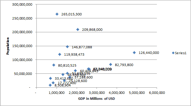
Unfortunately, our data labels are just numbers and are not particularly helpful. How can we change each point’s label to match the country name, instead? By modifying the Points object!
We can iterate through each item in the collection and apply text values to each one. Before we do that, recall we’ve removed the two outliers China and the USA, so points 1 and 2 are not present in the chart (neither is India, point 6). However, they still exist in the Points collection, so we’re still able to iterate without having to worry about encountering errors.
For countryRow = 2 To 20
    oChart.SeriesCollection(1).Points(countryRow - 1).DataLabel.Text = Cells(countryRow, 1).Value
Next countryRow
and we end up with this chart, which is much easier to read:
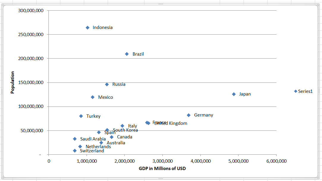
Naming the Series
Notice how there’s a legend on the right side showing
oChart.SeriesCollection(1).Name = "GDP vs Pop"or
oChart.SeriesCollection(1).Name = Range("B1") & "-" & Range("C1")The second method demonstrates how you can refer to cells in your series names. In our example, we actually concatenated two cells, though this makes the series name quite long.
Since we only have one series, we can completely remove the legend. A legend isn’t necessary if you’re only plotting one relationship. If you have several series, though, using a legend is quite useful, as viewers cannot deduce data categories.
oChart.Legend.DeleteIt’s also worth point out that often when you name a series, Excel will automatically add a title to the top of your chart.
Higher Dimensional Information
Our screens are two-dimensional and therefore we can only display two dimensional data on them (Okay… Or three dimensional if you use a 3D chart). Despite this limitation, we can still make our charts reflect higher dimensional data by changing the markers themselves. You usually see this in the coloring, sizing, or styling of the markers.
For example, if we wanted to show which countries had more mobile phones than people, we could easily calculate that with a macro and apply a specific marker or color to those countries.
Let’s make countries that have more people than phones red circles, as opposed to blue diamonds. If the number of people is greater than the number of phones by 15%, let’s also make those circles hollow. You would program this logic using a VBA snippet like this:
For countryRow = 2 To 20
    If Cells(countryRow, 4) - Cells(countryRow, 3) < 0 Then
        oChart.SeriesCollection(1).Points(countryRow - 1).MarkerStyle = xlCircle
        oChart.SeriesCollection(1).Points(countryRow - 1).MarkerBackgroundColor = vbRed
        oChart.SeriesCollection(1).Points(countryRow - 1).MarkerForegroundColor = vbRed
        If Cells(countryRow, 3) / Cells(countryRow, 4) > 1.15 Then
            oChart.SeriesCollection(1).Points(countryRow - 1).MarkerBackgroundColor = vbWhite
        End If
    End If
Next countryRow
The resulting plot is a little dense, but you can easily extract information about an extra dimension by simply looking at the plot. If the population is greater than the number of phones, we make the marker a circle and color it red. The foreground color will show up as the outline and the background color is the inner part. If the number of people exceeds the number of mobile phones by 15% we make the background color (fill or inner part) white.
Now let’s put all these steps together into a final advanced VBA scatter plot creation macro.
Option Explicit

Sub create_advanced_vba_scatter_plot()
Dim ochart As Object, ochartObj As Object
Dim countryRow As Integer, lastrow As Integer
Set ochartObj = ActiveSheet.ChartObjects.Add(Top:=10, Left:=325, Width:=600, Height:=300)
Set ochart = ochartObj.Chart
ochart.ChartType = xlXYScatter

'Set ochart = ActiveSheet.ChartObjects(1).Chart 'uncomment this and comment the 3 lines above
                                                'if chart already created
ochart.SeriesCollection.Add Source:=Range("B2:B21")

ochart.SeriesCollection(1).XValues = Range("B2:B21")
ochart.SeriesCollection(1).Values = Range("C2:C21")

ochart.Axes(xlCategory).HasTitle = True
ochart.Axes(xlCategory).AxisTitle.Caption = "GDP in Millions of USD"
ochart.Axes(xlValue).HasTitle = True
ochart.Axes(xlValue).AxisTitle.Caption = "Population"
ochart.SeriesCollection(1).HasDataLabels = True

lastrow = Range("D" & Rows.Count).End(xlUp).Row
For countryRow = 2 To lastrow
    ochart.SeriesCollection(1).Points(countryRow - 1).DataLabel.Text = Cells(countryRow, 1).Value
Next countryRow

ochart.SeriesCollection(1).Name = Range("B1") & " vs. " & Range("C1")
ochart.Legend.Delete

For countryRow = 2 To lastrow
    If Cells(countryRow, 4) - Cells(countryRow, 3) < 0 Then
        ochart.SeriesCollection(1).Points(countryRow - 1).MarkerStyle = xlCircle
        ochart.SeriesCollection(1).Points(countryRow - 1).MarkerBackgroundColor = vbRed
        ochart.SeriesCollection(1).Points(countryRow - 1).MarkerForegroundColor = vbRed
        If Cells(countryRow, 3) / Cells(countryRow, 4) > 1.15 Then
            ochart.SeriesCollection(1).Points(countryRow - 1).MarkerBackgroundColor = vbWhite
        End If
    End If
Next countryRow

End Sub
You’ll notice in this macro I added a bit of code to find the last used row with VBA.
When we run this macro, we end up with this good-looking informative chart that conveys more information than traditionally provided on an XY scatter plot:
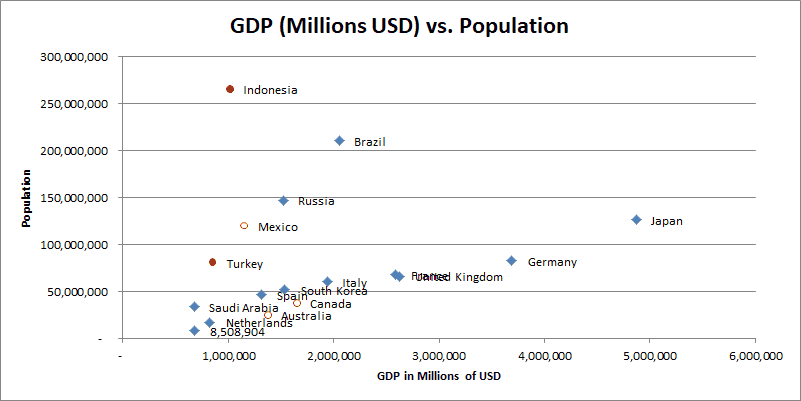
A 2D chart that displays information in four dimensions (population, GDP, and two ratios about mobile phones-population)
Of course, you’d still need to explain to the viewer what all these colors and shapes mean.
For more advanced scatter plots, you don’t have to limit yourself to binary “yes or no” conditions. Another idea might be to get the number of brain cancer cases for each country and then create a sliding scale for sizes or colors, where bigger or redder markers mean a higher prevalence of brain cancer. A study like this is how graduate student and scientists attempt to correlate (or disprove) cell phone use to disease prevalence.
You can find the other marker properties in this Microsoft Documentation if you want to dig deeper and change other parts of the Point objects.
Conclusion
In this tutorial, we gave you a lot of neat VBA scatter plot tips and we even discussed how to customize the plots to convey more information than traditionally provided. Oftentimes with plots it’s easier to use the GUI for one-off changes, but something like showing higher-dimensional data, like we just demonstrated, is actually a good example where scripting up a few lines of VBA code can make your scatter plot creation much easier, even if it is a one-time action.
Handling your scatter plots with VBA is also helpful when you’re trying to design all your plots with a uniform, consistent appearance. VBA will do that much better than the human eye would.
If you haven’t already done so, subscribe to my free wellsrPRO VBA Training Program using the form below. You’ll enjoy the unique VBA tips we send your way.

