- Introduction
- Single Density Plot from a Pandas DataFrame
- Multiple Pandas Density Plots from a DataFrame
Introduction to Pandas Density Plots
A kernel density estimation plot (KDE or density plot), like the histogram, is a powerful tool for observing the distribution of data. The density plot can be considered a continuous form of the histogram (for most purposes) that shows an estimate of the continuous distribution of a random variable. Pandas DataFrames that contain our data come pre-equipped with methods for creating density plots, making preparation and presentation easy.
We can create density plots from Pandas DataFrames using the pandas.DataFrame.plot.kde DataFrame method, which is a sub-method of pandas.DataFrame.plot. Pandas uses the Python module Matplotlib to create and render all plots, and each plotting method from pandas.DataFrame.plot takes optional arguments that are passed to the Matplotlib functions. In this tutorial, we will cover the essential tools and options for plotting density plots in Pandas, but you should be aware that many more options (e.g. plot color, orientation, size, etc.) are available to be passed to the Matplotlib via pandas.DataFrame.plot.kde.
To illustrate creating density plots, we will assume we have the following DataFrame df containing test grades already available within our Python environment. You may recall this is the same data set we used to create histograms in our previous tutorial on creating histograms with Pandas.
df.info()
> <class 'pandas.core.frame.DataFrame'>
> RangeIndex: 746 entries, 0 to 745
> Data columns (total 3 columns):
> Test_1    746 non-null float64
> Test_2    746 non-null float64
> Type      746 non-null int64
> dtypes: float64(2), int64(1)
> memory usage: 17.6 KB

df.head()
>        Test_1     Test_2  Type
> 0   85.868553  88.160763     2
> 1   88.017580  89.946783     3
> 2   76.811083  82.444485     3
> 3  100.000000  68.406203     3
> 4   94.719547  63.994755     2
Here we have two features, Test_1 and Test_2, along with a group number for each test given by the feature Type1.
If we would like to create a fast and simple density plot for exploratory analysis, we can use the pandas.DataFrame.plot.kde method directly:
df.plot.kde()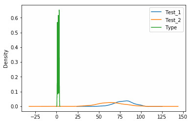
While this method is simple and straight-forward for exploratory analysis, it will plot all features including the Type column, which is meaningless for our purposes. To produce a more meaningful figure, we’re going to look at plotting individual features and modifying the KDE internal calculations.
Single Density Plot from a Pandas DataFrame
Unlike the pandas.DataFrame.hist method for histograms, the pandas.DataFrame.plot.kde method doesn’t possess a dedicated option for selecting columns to plot. To plot only one column from the DataFrame, we will have to slice the DataFrame and call the KDE method on the sliced data.
Recall that we can slice DataFrames with DataFrame[slice] where
df["Test_1"].plot.kde() # Plot a single column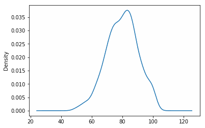
Modifying Density Plot Bandwidth Size
In kernel density estimation, the bandwidth is a parameter that specifies the level of smoothing applied to the curve. Higher values of the bandwidth will generate smoother curves, while lower values will produce more jagged but higher resolution curves. The choice of this parameter depends on the application on which you are working, however full analysis of a data distribution would use multiple values to ensure that both minor trends are not overlooked and noise in the data is not over-exaggerated.
The bandwidth parameter is set with the bw_method option. Let look at plotting several different values of bandwidth:
df["Test_1"].plot.kde(bw_method=0.5) # Plotting bandwidth size of 0.5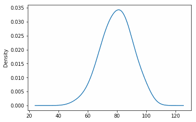
df["Test_1"].plot.kde(bw_method=0.1) # Plotting bandwidth size of 0.1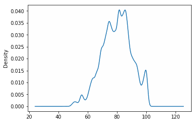
We can see from above that as we shrink the bandwidth, more noise is incorporated into the density plot. The bandwidth can be thought of as a continuous form of a histogram’s bin size and can be adjusted in a similar fashion.
Multiple Pandas Density Plots from a DataFrame
To plot multiple features in a single density plot, we’ll have to slice the DataFrame prior to calling the plotting feature - just like we did in the previous section. To show what we mean, we’re going to plot both the
df[["Test_1", "Test_2"]].plot.kde() # Plot both columns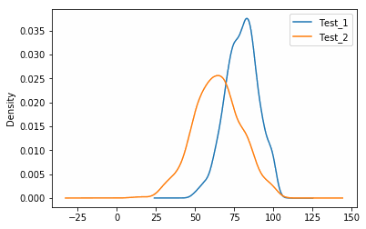
Plotting Density Plots with Histograms
Because KDE curves are commonly associated with histograms, it is not uncommon to see them plotted together as a histogram with its “smoothed” equivalent. To plot both density plots and histograms on the diagram, we can call pandas.DataFrame.plot.hist followed by pandas.DataFrame.plot.kde. However, if we call these functions consecutively, we will see what appears to be erroneous results since the scales of the two figures are so different:
df["Test_1"].plot.kde()
df["Test_1"].plot.hist() # This will produce the wrong plot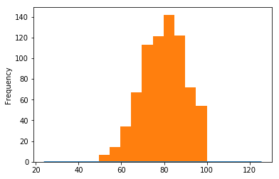
The histogram dominates the graph because the y-axis for the histogram is in number of observations, whereas the y-axis for the KDE curve is in normalized frequency (which is always less than 1). To fix this problem, we will need to normalize the histogram values to match the KDE values. The pandas.DataFrame.plot.hist method has a builtin normed option that will perform this normalization for us:
df["Test_1"].plot.kde()
df["Test_1"].plot.hist(normed=True) # Histogram will now be normalized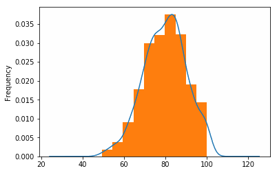
Did you find this free tutorial helpful? You can find more great Python tips and tutorials by subscribing to our systematic Python training program below. Not ready to join? Share this article with your friends, classmates, and coworkers on Facebook and Twitter, instead! When you spread the word on social media, you’re helping us grow so we can continue to provide free tutorials like this one for people around the world.
-
Unlike the
pandas.DataFrame.histmethod for histograms, the density plotting methods do not have a builtin method of grouping data by a feature column likeType. To create multiple plots of data grouped by a feature, the DataFrame will have to manually be grouped using the Pandaspandas.DataFrame.groupbymethod prior to plotting. ↩
