Python’s Matplotlib library is one of the most widely used data visualization libraries. With Matplotlib, you can plot your data using all kinds of chart types, including line charts, bar charts, pie charts and scatter plots.
Matplotlib lets you plot a single chart but it also allows you to draw multiple charts at once in the form of grids.
In this tutorial, we’ll demonstrate exactly how to draw multiple plots with the Matplotlib library.
Plotting a Single Plot
Before we show you how to plot multiple plots, let’s make sure we have the fundamentals down by walking through an example showing how to draw a single plot with Matplotlib. In this example, we’re going to draw a line plot.
To draw plots with Matplotlib, use the pyplot submodule from the Matplotlib library.
Specifically, to draw a line plot, you need to call the plot() function from the pyplot module and pass it lists of values for your x and y axes.
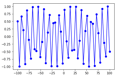
The script below draws a line plot for the sine function. The input values consists of 50 equidistant points between -100 to 100.
import matplotlib.pyplot as plt
%matplotlib inline

import numpy as np

x = np.linspace(-100, 100, 50)

y_sin = [np.sin(i) for i in x]

plt.plot(x, y_sin, 'bo-')
Output:
Note: The %matplotlib inline snippet only works with the Jupyter Notebook. If you’re not using Jupyter Notebook, just add plt.show() right after the point where we start making plots.
Plotting Multiple plots
Once you know how to do that, you’re ready to plot multiple plots. Again, Matplotlib allows you to plot multiple plots in the form of a grid. There are a couple of ways to do it:
- Using the
subplot()function - Using the
subplots()function
Using the subplot() function
To draw multiple plots using the subplot() function from the pyplot module, you need to perform two steps:
-
First, you need to call the
subplot()function with three parameters: (1) the number of rows for your grid, (2) the number of columns for your grid, and (3) the location or axis for plotting. For instance, thesubplot(2,3,1)tells the Python interpreter that the next plot should be plotted in a grid that contains 2 rows and 3 columns and the plot should appear at the first location in the grid (row 1, column 1). The order of the plotting locations first goes from left to right, then top to bottom. This means means that thesubplot(2,3,4)command will draw a plot in the second row and first column of the grid. -
After the
subplot()command, simply call the corresponding function or chart type you want to plot using the the pyplot module. For instance, the script below makes line charts using theplot()method.
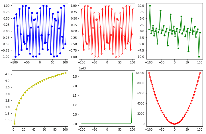
This script is going to make six line plots in a grid of two rows and three columns, using the subplot() function.
import matplotlib.pyplot as plt
import numpy as np
import math

%matplotlib inline

x = np.linspace(-100, 100, 50)

y_sin = [np.sin(i) for i in x]
y_cos = [np.cos(i) for i in x]
y_tan = [np.tan(i) for i in x]

y_log = [np.log(i) for i in x]
y_exp = [np.exp(i) for i in x]
y_sqr = [i*i for i in x]


plt.rcParams["figure.figsize"] = [12,8]

plt.subplot(2,3,1)
plt.plot(x, y_sin, 'bo-')

plt.subplot(2,3,2)
plt.plot(x, y_cos, 'rx-')

plt.subplot(2,3,3)
plt.plot(x, y_tan, 'g*-')

plt.subplot(2,3,4)
plt.plot(x, y_log, 'y<-')

plt.subplot(2,3,5)
plt.plot(x, y_exp, 'g')

plt.subplot(2,3,6)
plt.plot(x, y_sqr, 'r*-')

plt.show()
Output:
Using the subplots() function
With the subplot() function, you need to set the location for every subsequent plot. The subplots() function eliminates this requirement.
You can set the the number of rows and columns for your grid at once using the subplots() function from the pyplot module. The number of rows and columns are passed as integer values to the subplots() function. Depending on the number of rows and columns, the subplots() function returns a list of AxesSubplot objects.
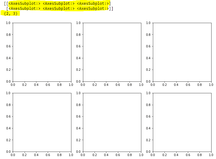
For instance, in the script below, you call the subplots() method that creates a grid with 2 rows and 3 columns. The “axes” variable in the script below contains the list of “AxesSubplot” objects which are printed on the console.
import matplotlib.pyplot as plt
import numpy as np
import math

x = np.linspace(-100, 100, 50)

y_sin = [np.sin(i) for i in x]
y_cos = [np.cos(i) for i in x]
y_tan = [np.tan(i) for i in x]

y_log = [np.log(i) for i in x]
y_exp = [np.exp(i) for i in x]
y_sqr = [i*i for i in x]

plt.rcParams["figure.figsize"] = [12,8]

fig, axes = plt.subplots(nrows= 2, ncols=3)

print(axes)
print(axes.shape)

plt.show()
In the output, you can see a list of lists corresponding to the rows and columns of your grid. You can also see the empty axes. We’ve highlighted the list in yellow, along with the grid dimensions.
Output:
The next step is to draw plots in these empty charts. To do this, you have to select an item from the list of AxesSubplot objects and call the plot() function using that object.
For example, to draw a plot at the first row and first column in the grid, you need to access the AxesSubplot at index [0,0]. Notice the index numbers for the subplots begin at 0.
The script below draws six line plots in 2 rows and 3 columns using the subplots() function.
import matplotlib.pyplot as plt
import numpy as np
import math

x = np.linspace(-100, 100, 50)

y_sin = [np.sin(i) for i in x]
y_cos = [np.cos(i) for i in x]
y_tan = [np.tan(i) for i in x]

y_log = [np.log(i) for i in x]
y_exp = [np.exp(i) for i in x]
y_sqr = [i*i for i in x]


plt.rcParams["figure.figsize"] = [12,8]

fig, axes = plt.subplots(nrows= 2, ncols=3)


axes[0,0].plot(x, y_sin, 'bo-')

axes[0,1].plot(x, y_cos, 'rx-')

axes[0,2].plot(x, y_tan, 'g*-')

axes[1,0].plot(x, y_log, 'y<-')

axes[1,1].plot(x, y_exp, 'g')

axes[1,2].plot(x, y_sqr, 'r*-')

plt.show()
Output:
That’s all there is to it! We have a lot of tutorials showing how to visualize data with Python, including with Pandas and Seaborn. If you want more tutorials like these, go ahead and subscribe using the form below and we’ll send them your way.


