Data analysis is one of the most important prerequisites to developing decision support and data-centric applications. Since a picture is worth a thousand words, the importance of visual data representation increases tenfold. This article explains how to perform data visualization in Python. Several libraries are available for data visualization in Python, including Matplotlib and Pandas.
We’ve talked a lot about data visualization techniques in Pandas (Pandas Boxplots, Density Plots, Histograms), but in this article you will learn how the Seaborn library can be used for data visualization in Python.
Behind the scenes, the Seaborn library uses the functionalities of the Matplotlib library. However, seaborn not only improves Matplotlib but provides a variety of additional plotting capabilities. Therefore, without any ado, let’s start plotting with Seaborn.
Note: All the codes in this article are compiled with the Jupyter Notebook.
Seaborn Installation
To install the Seaborn library, you can use pip installer. Execute the following command in your terminal to install the seaborn library:
$ pip install seaborn
The Dataset
We will be using the seaborn library and then loads the
import seaborn as sns
%matplotlib inline
sns.set_style("darkgrid")

tips_dataset = sns.load_dataset("tips")
The %matplotlib inline code will give you an error if you’re not using the Jupyter Notebook. Just comment it out and add the line plt.show() right after the point where we start making plots.
In the above script the set_style() method sets the style of the plots. Next, the load_dataset() method is used to load the
Let’s now plot the shape of the dataset:
tips_dataset.shapeOutput:
(244, 7)
The output shows that the head() method as follows:
tips_dataset.head()Output:
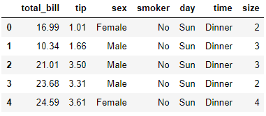
The output shows that the tips dataset has 6 columns. The total_bill column contains the amount of the total bill. The tip column contains the amount of the tip paid on the bill. The sex columns contains the gender of the person who paid the bill. The smoker column contains information regarding whether or not the person who paid the bill is a smoker. The time column corresponds to the time of the day i.e. lunch or dinner, and finally the size column tells the number of total people served.
Plotting with Seaborn
In this section, you will see how to plot the following graphs with the Seaborn library:
- Histogram
- Scatter Plot
- Line Plot
- Bar Plot
- Factor Plot
- Box Plot
- Heatmap
- Pair Plot
Histogram
Histogram shows frequency distribution for a particular column in a dataset. For instance, if you want to see how many times the amount of total_bill is between 10-20, 20-30, 30-40 and so on, you can plot a histogram. The distplot() function is used to plot a histogram for a certain column in the dataset. For instance, to plot a histogram for the total_bills column, the distplot() function can be used as follows:
sns.distplot(tips_dataset['total_bill'])Output:
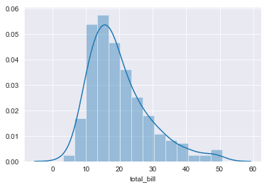
You can see that most of the time, the amount of the bill is between 10 and 20.
Scatter Plot
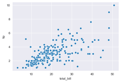
The scatter plot draws a graph that shows the interaction between the two numeric columns in the form of scattered data points. The scatterplot() function is used to draw a scatter plot as shown below:
sns.scatterplot(x="total_bill", y="tip", data=tips_dataset)The above script plots a scatter plot for total_bill on the x-axis and the tip on y-axis. Here is the output:
Output:
Line Plot
The line plot draws relationship between two columns in the form of a line. The lineplot() function of the seaborn library is used to draw a line plot. The following script draws a line plot for the size on the x-axis and total_bill column on the y-axis.
sns.lineplot(x="size", y="total_bill", data=tips_dataset)Output:
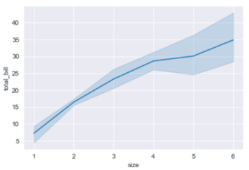
The output shows that with the increase in the number of people in the group for whom the bill is paid, the total bill also increases which is pretty understandable since more people order more food items and fewer people in a group order fewer food items.
Bar Plot
The bar plot is used to plot the mean of a numerical column against all the unique values in a categorical column. For instance, if you want to plot the average amount that people spend during lunch and dinner, you can plot the following bar plot.
sns.barplot(x='time', y='total_bill', data=tips_dataset)Output:
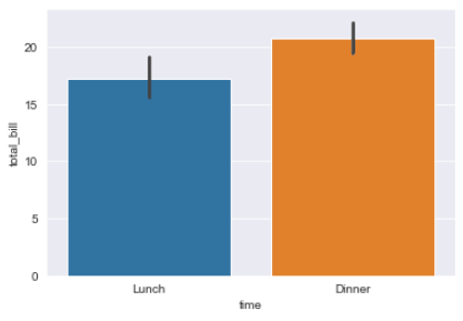
The result shows that the average amount of bills is higher for dinner, in comparison to the average amount of bills for lunch.
Factor Plot
The factor plot is used to plot multiple categorical columns against a single numerical column. For instance, if you want to plot the average bill against the time of day, and then you want the time information further divided into whether the person who paid the bill smokes or not, you can use the factor plot as shown below:
sns.factorplot("time", "total_bill", "smoker", data=tips_dataset, kind="bar")Output:

The output shows that average amount of bills is higher for dinner. Also, for both dinner and lunch, smokers spend slightly more as compared to non-smokers.
Box Plot
The box plot is used to plot the quartile information for a numerical column against the unique values in a categorical column. The following script plots quartile information for the total_bill column for both lunch and dinner.
sns.boxplot(x='time', y='total_bill', data=tips_dataset)Output:

The output shows that for lunch the first quartile for the amount of bills lies between 8 and 12 (approximately), similarly the second quartile lies between 12 and 15. For dinner, the first quartile lies between 3 and 15 (approximately) and so on.
You can categorize box plots further. For instance, the following script plots box plots for total bill during lunch and dinner time where the bill is paid by a Male or Female.
sns.boxplot(x='time', y='total_bill', data=tips_dataset, hue="sex")Output:
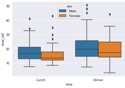
You can see that for both lunch and dinner, males paid more bills than females. Furthermore, the difference in the average bills paid by males and females is higher for lunch, as compared to the average bill paid during dinners.
Heat Map
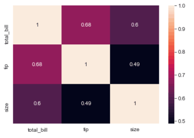
A heat map is a matrix-like plot used to plot the degree of correlation between multiple numerical columns. The heatmap() function of the Seaborn library is used to plot heatmaps. The heatmap() function accepts a dataframe with columns as well as row headers. The corr() function, which returns the dataset with both column and row headers. You can then use the heatmap() function to plot the heatmap for the dataset as shown below.
corr = tips_dataset.corr()
sns.heatmap(corr, annot=True)
Output:
Pair Plot
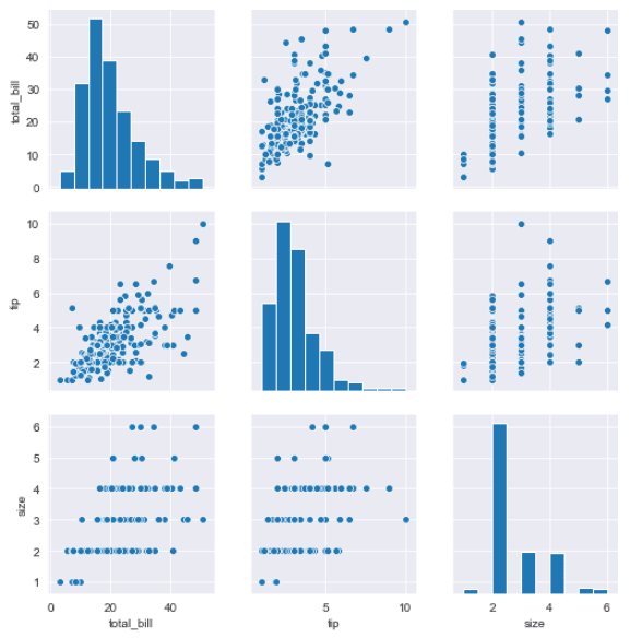
The pair plot is a graph that plots the relationship between all the numeric columns in the form of multiple scatter plots. Along the diagonals, the histogram of the columns is displayed. The pairplot() function is used to plot the pair plot as shown below:
sns.pairplot(tips_dataset)Output:
Conclusion
Seaborn is an extremely useful library for data visualization in Python. In this article you saw how to plot some basic graphs with Seaborn. However, this is merely a tip of the iceberg. Seaborn has much more to offer. We’ll be publishing more seaborn plotting tutorials soon so subscribe below to make sure you don’t miss them!
