- Quick Start: Creating a Voronoi Diagram with GeoPandas and geoplot
- Explanation
- Creating a GeoPandas DataFrame
- Creating Base Maps and Projections with GeoPandas
- Plotting Voronoi Regions with Geoplot
Quick Start: Creating a Voronoi Diagram with GeoPandas and geoplot
Before beginning, ensure you have GeoPandas, geoplot, and shapely installed for your Python version:
You’ll need to already have Pandas installed, as well, since we’ll be creating our Voronoi diagrams from a Pandas DataFrame.
To create the Voronoi Diagram, first import your data into a Pandas DataFrame. For our example, the Pandas DataFrame should have “latitude” and “longitude” columns containing the float values used to define the latitude and longitude regional center-points, and a “value” column containing the float values used to define a region’s color. Assuming the DataFrame is stored as df, the following code will produce a Voronoi Diagram over the contiguous United States:
# Import Geopandas modules
import geopandas
import geoplot
# Import shapely to convert string lat-longs to Point objects
from shapely.geometry import Point

# Setup Geopandas Dataframe
# Assumes data stored in pandas DataFrame df
geometry = [Point(xy) for xy in zip(df.longitude, df.latitude)]
gdf = geopandas.GeoDataFrame(df, geometry=geometry)

# Import USA data for region clipping
USA = geopandas.read_file(geoplot.datasets.get_path('contiguous_usa'))

# Set the map projection
proj = geoplot.crs.AlbersEqualArea(central_longitude=-98, central_latitude=39.5)

# Setup the Voronoi axes; this creates the Voronoi regions
ax = geoplot.voronoi(gdf,  # Define the GeoPandas DataFrame
                     hue='values',  # df column used to color regions
                     clip=USA,  # Define the voronoi clipping (map edge)
                     projection=proj,  # Define the Projection
                     cmap='Reds',  # color set
                     k=None,  # No. of discretized buckets to create
                     legend=True, # Create a legend
                     edgecolor='white',  # Color of the voronoi boundaries
                     linewidth=0.01  # width of the voronoi boundary lines
                    )
# Render the plot with a base map
geoplot.polyplot(USA,  # Base Map
                 ax=ax,  # Axis attribute we created above
                 extent=USA.total_bounds,  # Set plotting boundaries to base map boundaries
                 edgecolor='black',  # Color of base map's edges
                 linewidth=1,  # Width of base map's edge lines
                 zorder=1  # Plot base map edges above the voronoi regions
                 )
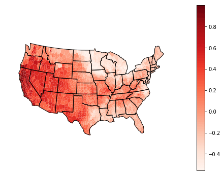
This code will create the following plot:

Explaining How to Create Voronoi Diagrams with GeoPandas
This tutorial will explain how to create Voronoi Diagrams, a spatial data-analysis tool, using GeoPandas and Geoplot within Python. Voronoi Diagrams are used when a 2-D surface needs to be divided into regions using only a characteristic midpoint of the region. These diagrams are most useful when very little is known about the region other than a single midpoint value. This tutorial will explore plotting these diagrams on maps, specifically of the contiguous United States, as a way of visualizing the geographical distribution of data given a set of latitude and longitude points.
The data used in this example will be contained within the df pandas DataFrame. This DataFrame has the following format:
df.info()
> <class 'pandas.core.frame.DataFrame'>
> RangeIndex: 2984 entries, 0 to 2983
> Data columns (total 3 columns):
> latitude     2984 non-null float64
> longitude    2984 non-null float64
> values       2984 non-null float64
> dtypes: float64(3)
> memory usage: 70.0 KB

df.head()
> 	latitude	longitude	values
> 0	38.509640	-122.354279	0.999981
> 1	35.349266	-120.760239	0.921824
> 2	38.461067	-122.941132	0.910041
> 3	38.756382	-120.806641	0.903352
> 4	39.124657	-122.716995	0.894753
Creating a GeoPandas DataFrame
Before we can plot any of our data in Geoplot, we must setup a GeoPandas GeoDataFrame. The primary difference between a GeoDataFrame and a Pandas DataFrame is that a GeoDataFrame holds geometry data for each row that can be used programatically to create plots. df contains the latitude-longitude information we need, but not in a format easily processed by geometric plotting software. To create our geometries, we will first use the shapely Point class to create a series of Point objects. We will use the zip function to provide a set of (longitude, latitude) tuples to the Point class within a list comprehension to create a list of Point objects:
from shapely.geometry import Point
geometry = [Point(xy) for xy in zip(df.longitude, df.latitude)]
We can now create our GeoDataFrame using the geopandas.GeoDataFrame function by providing our original DataFrame with the geometry list we created:
import geopandas
gdf = geopandas.GeoDataFrame(df, geometry=geometry)
Note: Some applications and datasets provide geometries using a well-known-text (WKT) column. If this column is already within the pandas DataFrame, then geopandas.GeoDataFrame can be called directly by specifying the geometry parameter to be the column name containing the WKT column.
Creating Base Maps and Projections with GeoPandas
Now that we’ve created our plotting data, we need to setup how we want the data plotted on a base map.
The first thing we’ll specify is the base map of the United States which will be used to “clip” the boundaries of our Voronoi regions, as well as plot country and state boundaries on our final plot. GeoPandas comes pre-equipped with a selection of base maps and boundaries we can choose from. We can specify the base map and boundaries of the contiguous USA using the following Python snippet:
# Import USA data for region clipping
USA = geopandas.read_file(geoplot.datasets.get_path('contiguous_usa'))
Because the world is round, and our computer screens are flat, we’ll need to set how we’ll want our spherical coordinates plotted on a flat surface. For this example we’ll use the Albers projection. This projection is specified using the geoplot.crs.AlbersEqualArea object. We’ll also specify the parameters central_longitude and central_latitude to “focus” the projection on an area that best suits a map of the United States:
# Set the map projection
proj = geoplot.crs.AlbersEqualArea(central_longitude=-98, central_latitude=39.5)
The GeoPandas Projection reference has additional information on other projection options.
Plotting Voronoi Regions with Geoplot
Now we’re ready to begin plotting. Plotting the regions will be contained within two steps: creating the Voronoi Diagram regions, and plotting the regions on the base map.
Creating Voronoi Regions with Geoplot
We will first create the Voronoi regions using the geoplot.voronoi function to create a GeoAxesSubplot object assigned to the ax variable to pass to a plotting function later. Let’s look at the full function call first before we break down the arguments:
# Setup the Voronoi axes; this creates the Voronoi regions
ax = geoplot.voronoi(gdf,  # Define the GeoPandas DataFrame
                     hue='values',  # df column used to color regions
                     clip=USA,  # Define the voronoi clipping (map edge)
                     projection=proj,  # Define the Projection
                     cmap='Reds',  # color set
                     k=None,  # No. of discretized buckets to create
                     legend=True, # Create a legend
                     edgecolor='white',  # Color of the voronoi boundaries
                     linewidth=0.01  # width of the voronoi boundary lines
)gdf: The first argument specifies the GeoPandas DataFrame we created earlier.hue='values': Thehueargument specifies which column of the GeoPandas DataFrame is used to color the regions.clip=USA:clipis used to set the boundaries around which Voronoi Regions will be “clipped” or the maps in which the Voronoi regions will be defined. Here we’ve passed theUSA variable containing the contiguous USA boundaries we defined earlier.projection=proj:projectionspecifies the GeoPandas projection object used for projecting the Voronoi regions onto a map, which we’ve assigned to theproj object we created previously.cmap='Reds': thecmapsparameter specifies the color mapping set used in plotting the regions. Here we’ve specified a red color spectrum. This color mapping guide explains more options.k=None:kis the number of buckets used to bucket the color values. For example, ifk=10 then each of thevalueswill be divided into 10 buckets and only 10 distinct colors will be created. Settingk=None bypasses bucketing, and region coloring will be calculated on a continuous spectrum byvalue.legend=True:legendspecifies if a legend will be added to the plotedgecolor='white':edgecolorspecifies the color used to define the boundaries of the Voronoi regions.linewidth=0.01:linewidthcontrols the width of the Voronoi boundary lines.
Plotting Regions On GeoPandas Base Map
Now that we’ve created the Voronoi Diagram regions, let’s wrap up the plot by plotting the regions on a base map. We will create the plot by calling geoplot.polyplot which is used to plot polygon objects like our Voronoi regions. Let’s look at the full function call first before we break down the arguments:
# Render the plot with a base map
geoplot.polyplot(USA,  # Base Map
                 ax=ax,  # Axis attribute we created above
                 extent=USA.total_bounds,  # Set plotting boundaries to base map boundaries
                 edgecolor='black',  # Color of base map's edges
                 linewidth=1,  # Width of base map's edge lines
                 zorder=1  # Plot base map edges above the voronoi regions
)USA: The first parameter specifies theGeoDataFrameof the base map used for plotting. We specified this to be the same GeoPandas-supplied contiguous US map we defined above.ax=ax: Theaxparameter specifies whatGeoAxesSubplotobject to pass to the plotting tool. Here we’ll pass the Voronoi regions we created previously,ax .extent=USA.total_bounds:extentis an optional feature that sets the absolute boundaries used for plotting. This option is useful if the default plotting options shrink the image. Calling thetotal_bounds method on theUSA data region retrieves the overall bounding box on the GeoDataFrame that sets the rendering to only plot the totalUSAboundary.edgecolor='black': Theedgecolorparameter here specifies the color of the base map’s boundaries and interior lines.linewidth=1:linewidthsets the thickness of the base map’s boundary and interior lines.zorder=1:zorderspecifies the ordering of the plotting objects. Setting it to 1 will plot the base map lines on top of the Voronoi regions.
Once you combine these steps, like we did on our Quick Start code, you’ll get the following Voronoi Diagram:

Did you find this free Python tutorial helpful? Subscribe using the form above for more neat Python tutorials and share this article with your friends on Facebook and Twitter. When you spread the word on social media, you’re helping us grow so we can continue to provide free tutorials like this one for years to come.
