- Quick Start: Creating a US State Choropleth Map with Python Plotly
- Introduction
- Using Plotly Python Modules
Quick Start: Creating a US State Choropleth Map with Python Plotly
A choropleth map is an interactive geographic color heatmap for plotting data on top of a region of geography. To create your own, first, ensure you have Plotly for Python installed:
To create a choropleth map of US states, first import your data into a Pandas DataFrame. The Pandas DataFrame should at a minimum have a “state” column containing the two-letter USPS State abbreviation values used to define data locations, and a “value” column containing the float values used to define a state’s color. Assuming the DataFrame is stored as states_df, the following code will produce a US State choropleth map:
import plotly.express as px  # Be sure to import express
fig = px.choropleth(state_df,  # Input Pandas DataFrame
                    locations="state",  # DataFrame column with locations
                    color="value",  # DataFrame column with color values
                    hover_name="state", # DataFrame column hover info
                    locationmode = 'USA-states') # Set to plot as US States
fig.update_layout(
    title_text = 'State Rankings', # Create a Title
    geo_scope='usa',  # Plot only the USA instead of globe
)
fig.show()  # Output the plot to the screen
When you run this Python Plotly code, you’ll get the following interactive plot:
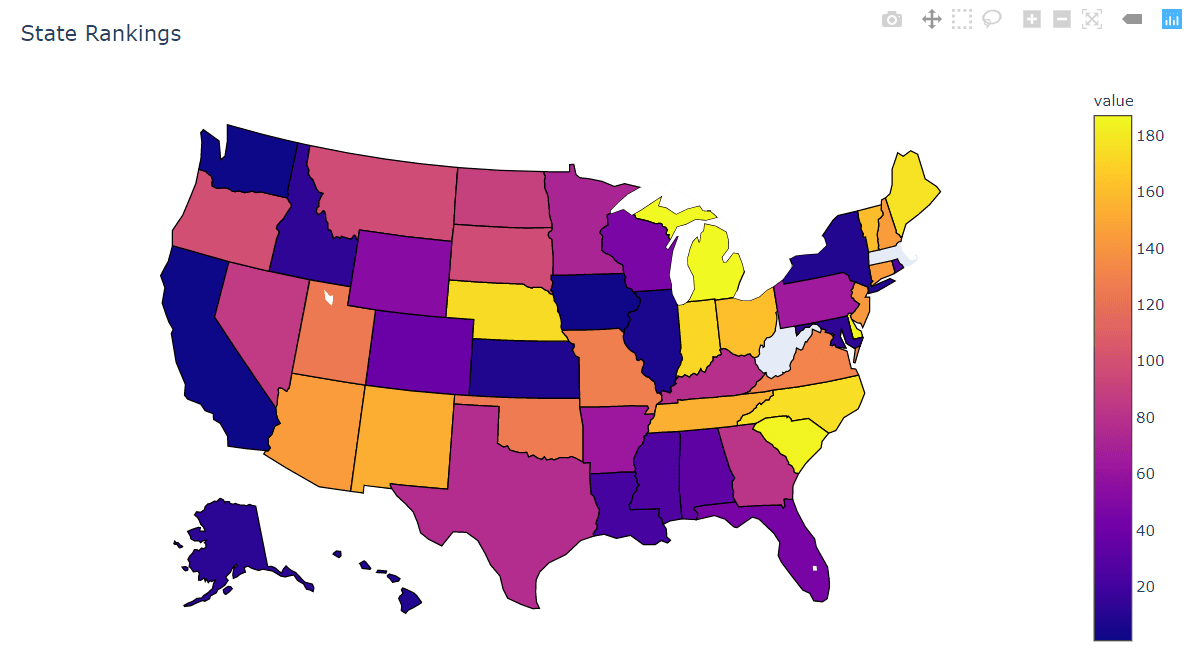
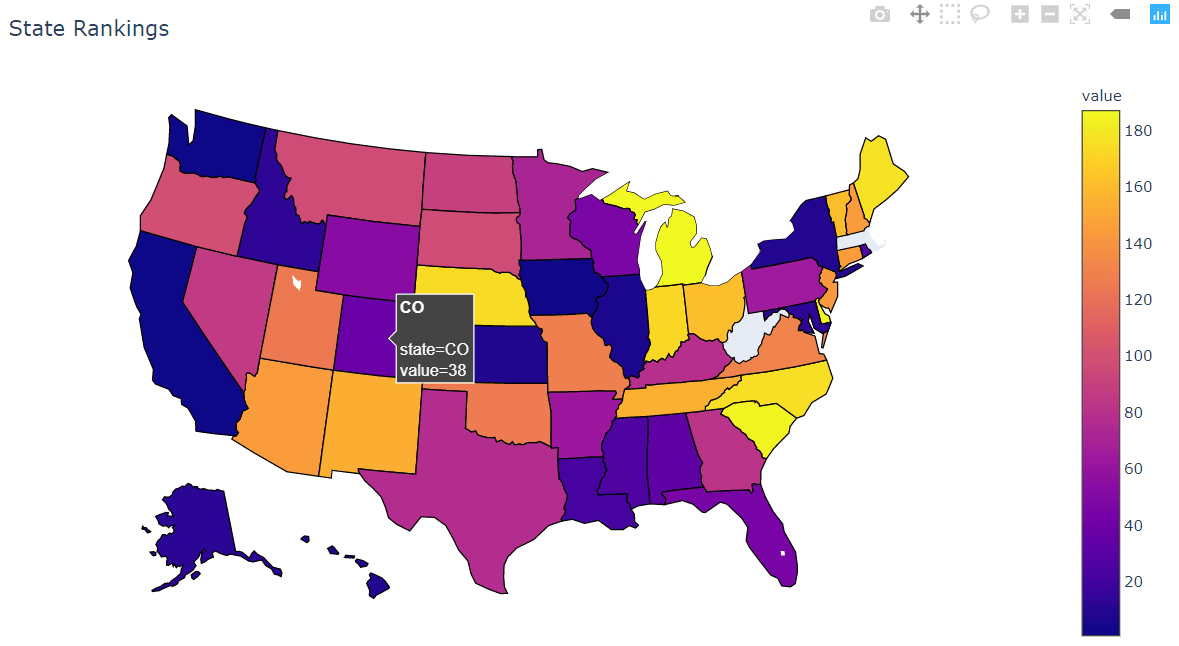
Notice that this is an interactive map, allowing for movement, zoom, and hover annotations:
Introduction to US State Choropleths Maps with Plotly
Heatmap plots over geographic regions, or a choropleth in the formal definition, have been a useful tool for assessing the regional spread of data since the dawn of cartography. It continues to hold many uses today. Having to manually search for cartographic data sets and plot coordinate data with a litany of projection choices can be painful, but Plotly provides an easy-to-use Python package for plotting your data on a wide array of predefined maps.
This tutorial will focus on plotting data on a map of US States using a pre-made state_df Pandas DataFrame that has the following format:
state_df.info()
> <class 'pandas.core.frame.DataFrame'>
> RangeIndex: 49 entries, 0 to 48
> Data columns (total 2 columns):
> state    49 non-null object
> value    49 non-null int64
> dtypes: int64(1), object(1)
> memory usage: 864.0+ bytes

state_df.head()
> 	state	value
> 0	   AL	   33
> 1	   AK	   12
> 2	   AZ	  144
> 3	   AR	   63
> 4	   CA	    1
Our DataFrame has a “state” column that contains the two-letter USPS State abbreviation corresponding to the state in which the data is represented. This format is crucial because Plotly will automatically associate each state abbreviation with its location on the map. The DataFrame also has a “value” column containing an arbitary set of float or integer values to be plotted with the associated state.
Note: Plotly expects DataFrames to be in the “tidy” format, or that each row contains a single record and each column contains a feature for that record. This means that each state should have at most one entry in the DataFrame.
Using Plotly Python Modules
Now that we have our Pandas DataFrame created and in the proper format, we can use the tools provided by Plotly to create our choropleth map.
Importing Plotly Express
First we will need to import the plotly.express module into our interpreter. It’s a common error to import this module as follows:
import plotly
x = plotly.express.[function](...)  # Not correct!
Importing this way will raise an import exception, as plotly.express is a separate Python package that is included with the Plotly installation. This is due to a historical quirk where old Plotly versions needed a dedicated installation of a plotly_express package that is now included in plotly. The correct way to import the module is as follows:
import plotly.express as px  # Here we've used px as a shortcut alias
x = px.[function](...)  # Correct!
Now we can use px as a shorthand form of calling the plotly.express module.
Using the Plotly choropleth Function
Creating the choropleth map with Plotly in Python is extremely easy with the built-in choropleth function. Let’s look at the full function call first before we break down the arguments:
import plotly.express as px  # Be sure to import express
fig = px.choropleth(state_df,  # Input Pandas DataFrame
                    locations="state",  # DataFrame column with locations
                    color="value",  # DataFrame column with color values
                    hover_name="state", # DataFrame column hover info
                    locationmode = 'USA-states') # Set to plot as US States
fig.show() # Output the plot to the screenstate_df: The first argument specifies the Pandas DataFrame we created previouslylocations="state": Thelocationsargument specifies which column of the Pandas DataFrame contains the state abbreviations, which we’ve set to thestate column for our particular DataFrame.color="value": Thecolorargument specifies which column of the Pandas DataFrame is used to color the given state region, which we’ve set to be thevalue column.hover_name="state": Thehover_nameargument specifies which column of the Pandas DataFrame is used provide additional information to the user when the cursor is hovered over the region. We’ve set it to thestate column to simply show the abbreviation of the state. You can get more creative in your own application.locationmode = 'USA-states': Thelocationmodeargument tells Plotly what kind of inputs it should expect to see in thelocationscolumn. We’ve set it to the builtin'USA-states' option to treat thelocationsinputs as USA state identifiers.
Running the choropleth function to create a figure, and using the fig.show() command to render the figure onto our screen will present the following:
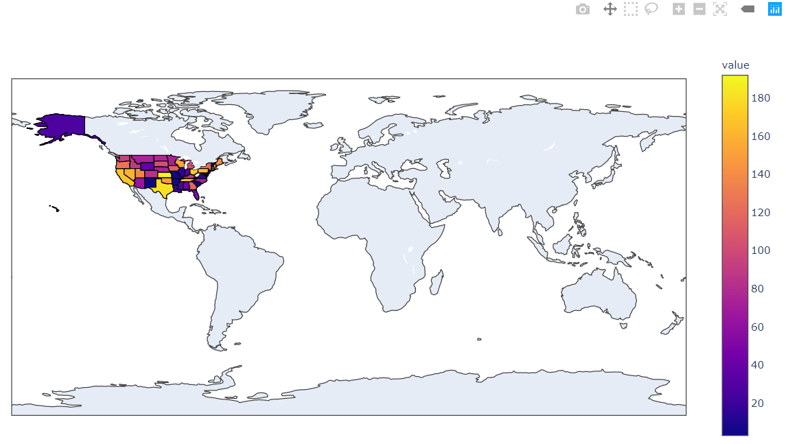
Hmm, that’s certainly a choropleth map of the US States, but it includes the whole planet! Let’s see what we can do to simplify the plot.
Changing Choropleth Plotting Regions
We can change figure plotting parameters by calling the update_layout method on the created fig object. We can create a title for the figure using the title_text parameter, and we can tell Plotly to plot a USA-only version of the map using the option geo_scope='usa'. With this information, we can update our function call as follows:
import plotly.express as px  # Be sure to import express
fig = px.choropleth(state_df,  # Input Pandas DataFrame
                    locations="state",  # DataFrame column with locations
                    color="value",  # DataFrame column with color values
                    hover_name="state", # DataFrame column hover info
                    locationmode = 'USA-states') # Set to plot as US States
fig.update_layout(
    title_text = 'State Rankings', # Create a Title
    geo_scope='usa',  # Plot only the USA instead of globe
)
fig.show()  # Output the plot to the screen
Note: We called the update_layout method after the figure was created with the choropleth function but before we called the fig.show() method. This is an important ordering as the plot is “lost” after the fig.show() method is called.
Now we get the close-up geographical plot we wanted:

Again, this is an interactive map so you can move it, zoom, and get hover annotations based on what we input to the hover_name option:

I hope you enjoyed this tutorial on Python choropleth maps. Subscribe using the form below and share this article on Facebook and Twitter. When you spread the word on social media, you’re helping us grow so we can continue to provide free tutorials like this one.
