A box plot, also known as box and whisker plot, plots data distribution for a particular variable in the form of quartiles, median, minimum and maximum values. A box plot is extremely handy if you want to observe how your data is distributed and spread. In addition to the quartile information and median value, the box plot can also plots outliers . In this tutorial, we’ll show you how to draw box plots with Python Seaborn library. In Seaborn, a box plot, is invoked with the boxplot function.
Note: All the codes in this article are compiled with the Jupyter Notebook.
Seaborn Installation
Like we discussed in our Seaborn line plot and Seaborn bar plot tutorials, you’ll need to install the Seaborn library to begin. You can do this with the pip installer using the following command:
$ pip install seaborn
Import Required Libraries
The following script imports the Seaborn library and the Matplotlib library. Since Seaborn is based on Matplotlib, we need to import both Seaborn and Matplotlib libraries, in order to use all the Seaborn functionalities.
import seaborn as sns
import matplotlib.pyplot as plt
import pandas as pd
%matplotlib inline
sns.set_style("darkgrid")
The %matplotlib inline code will give you an error if you’re not using the Jupyter Notebook. Just comment it out and add the line plt.show() right after the point where we start making plots.
Let’s change the default plot size so we have a better view of our box plots:
plt.rcParams['figure.figsize'] = (12,8)The Dataset
The dataset we will be using to draw our box plots is the Titanic dataset, which comes built-in with the Seaborn library. The Titanic dataset contains information regarding passengers who were onboard the ill-fated Titanic ship that sunk in 1912.
The following script imports the dataset and displays the first 5 rows of the dataset.
titanic_dataset = sns.load_dataset("titanic")
titanic_dataset.head()
Output:
Box Plot for Single variable
To draw a box plot with Seaborn, the boxplot() function is used. You can either pass the full dataframe column names to the x or y parameters or you can simply specify the column names in the x and y parameters and then specify the dataframe name in the dataset parameter.
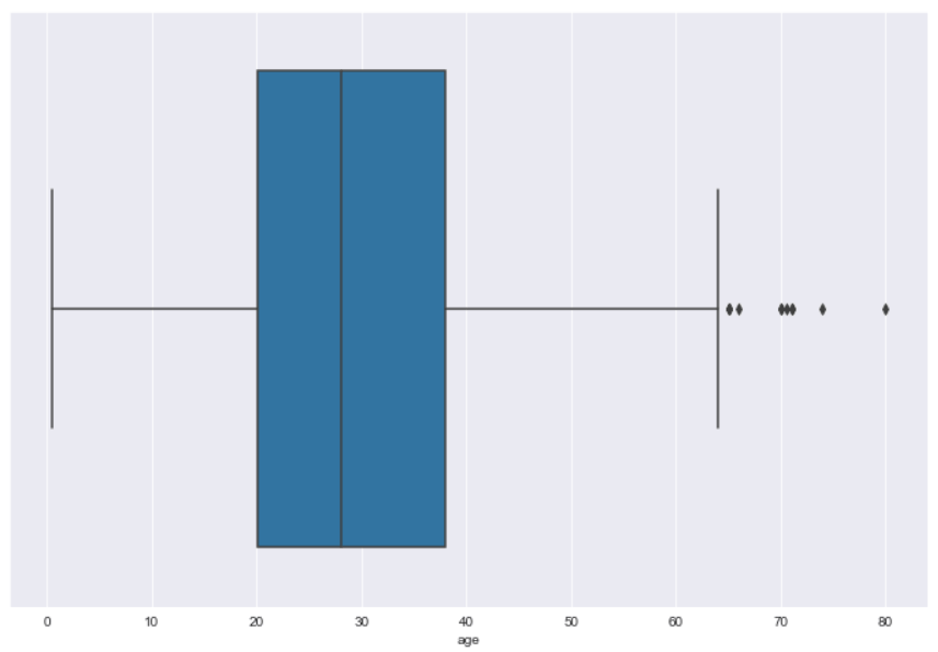
Let’s first draw a box plot for single variable. To do so, you have to pass the column name to the x attribute of the boxplot() function. For instance, the following script draws a horizontal box plot for the age column.
sns.boxplot(x=titanic_dataset["age"])Output:
The output shows that the median age of the passengers onboard Titanic was around 28. Also, 50% of the total passengers were aged between 20 and 38.
This plot illustrates why this type of plot is often call a box and whisker plot. The blue information forms the box and represents the quartiles (25th to 75th percentile), while the whiskers represent the rest of the data except for data it determines to be outliers. Outliers are shown by default beyond the edges of the whiskers.
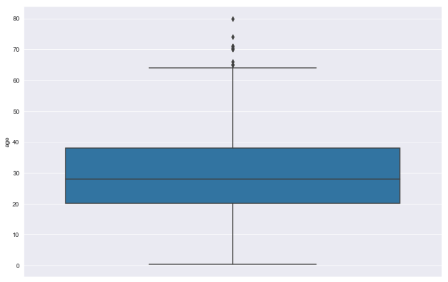
To draw a vertical box plot for single variable, simply pass the variable or column name to the y parameter as shown below:
sns.boxplot(y=titanic_dataset["age"])Output:
Seaborn Box Plots with Multiple Columns
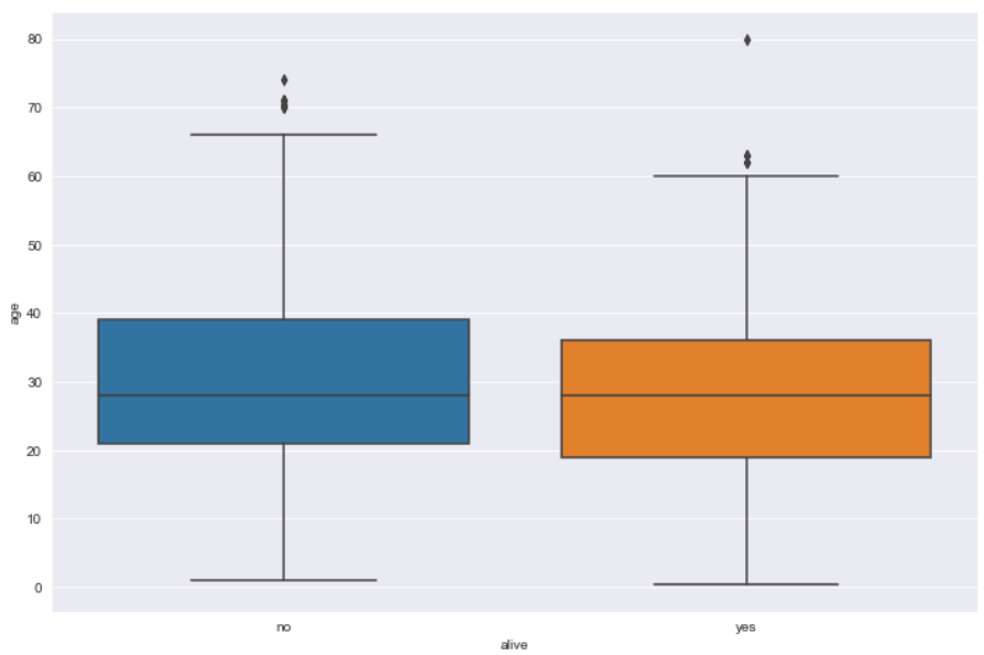
You can plot multiple box plots depending on the number of unique values in the categorical column for which you want to draw your box plot. The categorical column name is passed to the x variable while the numeric column name should be passed to the y variable. For instance, if you want to makes Seaborn box plots of ages for the passengers who are alive and those who are not alive, you could do so with the following script.
sns.boxplot(x='alive', y='age', data=titanic_dataset)Output:
The output shows that the median age of the passengers who are alive is slightly less than those who are not alive.
Categorizing Box Plots with the Hue Parameter
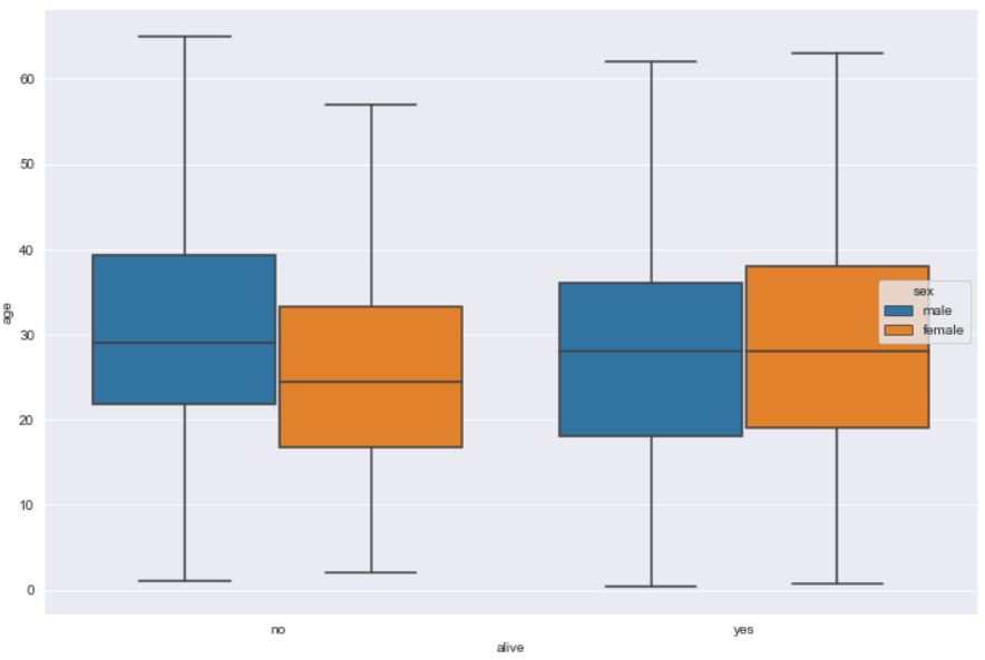
Categorical box plots can be further categorized via the hue parameter. For instance, in addition to the information regarding whether or not a passenger is alive, you can add additional information about the gender of the passengers via hue attribute. Look at the following script:
sns.boxplot(x='alive', y='age', hue='sex', data=titanic_dataset)In the output, you can see that in addition to being categorized as alive or not, the passengers are further categorized by gender. For instance, among passengers who are not alive, the median age of female passengers is less than the male passengers.
Output:
Removing Outliers from a Seaborn Box Plot
By default, the Seaborn box plot shows outliers. To remove outliers, you simply have to pass False as the value for the showfliers attribute as shown below:
sns.boxplot(x='alive', y='age', hue='sex', data=titanic_dataset, showfliers=False)Output:
Displaying Confidence Interval with a Notch
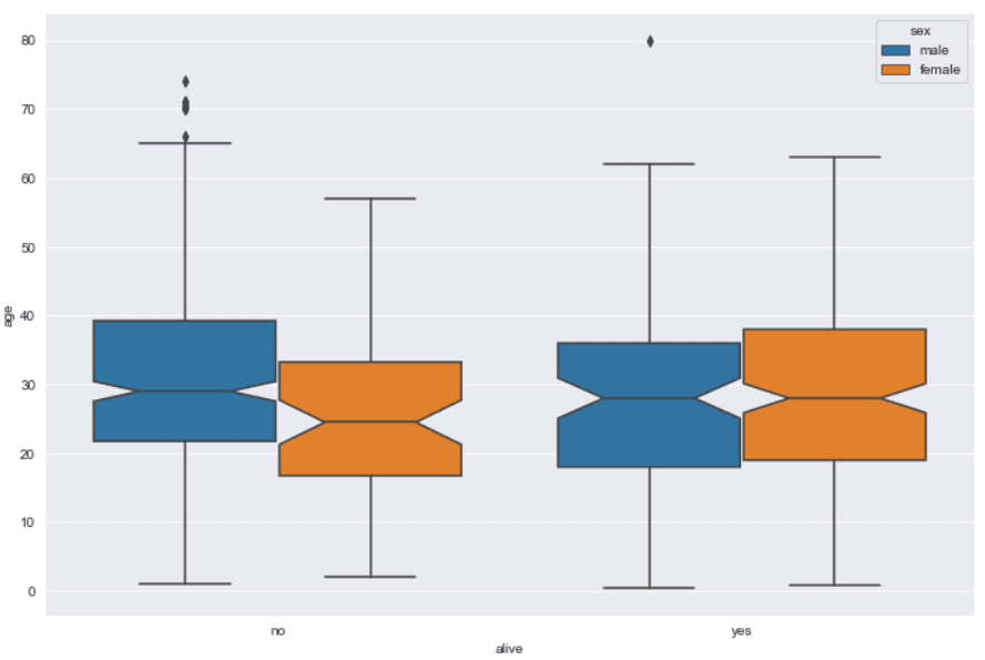
If you want to display the confidence interval for the median values displayed by a box plot, you can pass True as the value for the notch attribute.
sns.boxplot(x='alive', y='age', hue='sex', notch= True, data=titanic_dataset)Output:
Adjusting Box Plot Width
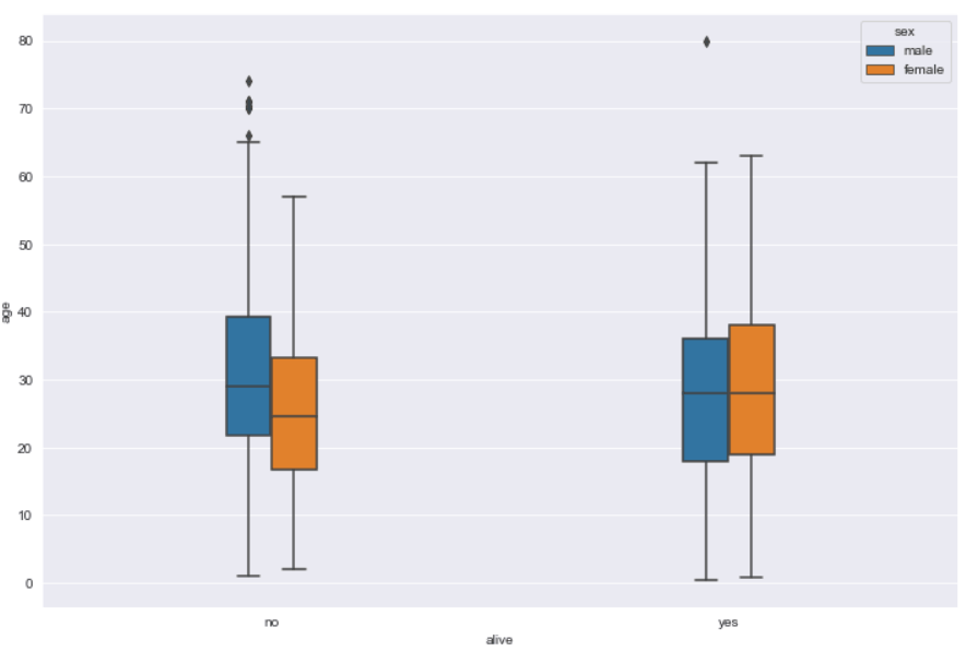
The width of the box plots can be increased or decreased. To do so, you have to pass a numeric value that corresponds to the ratio of the default box plot width. For instance, if you want to reduce the width of a Seaborn box plot to 20% of its original width, you can pass 0.2 as the value for the width attribute. Here is an example:
sns.boxplot(x='alive', y='age', hue='sex', width= 0.2, data=titanic_dataset)Output:
Nesting Box Plots via Dodge Parameter
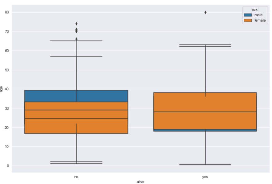
You can nest box plots generated as a result of the hue parameter. To create nested box plots in Seaborn, you need to pass False as the value for the dodge parameter as shown in the following example:
sns.boxplot(x='alive', y='age', hue='sex', dodge = False, data=titanic_dataset)Output:
The output here can be confusing since each categorical box plot is plotted on top of each other. In the plot above, it does show where the edge of the male top quartile is higher than the female for those passengers that are no longer alive and it extends below the female for those passengers that are alive.
Changing Seaborn Box Plot Colors
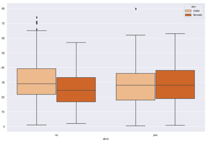
To change the color of a box plot, you need to pass a value to the pallete parameter of the boxplot() function. The list of all the possible values for the pallete attribute can be found here. An example showing how you can change the colors of a box plot is presented below:
sns.boxplot(x='alive', y='age', hue='sex', data=titanic_dataset, palette="Oranges")Output:
Changing Order of Box Plots
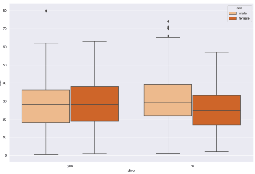
To change the order of categories in the box plot, you can simply pass the names of the categories in the form of a list to the order attribute. For instance, the following box plot will display the age distribution for the alive passengers on the left, and for those who are not alive on the right.
sns.boxplot(x='alive', y='age', hue='sex', order = ["yes", "no"] , data=titanic_dataset, palette="Oranges")Output:
Similarly, the hue order can be changed via the hue_order attribute.
Setting Labels and Titles for a Box Plot
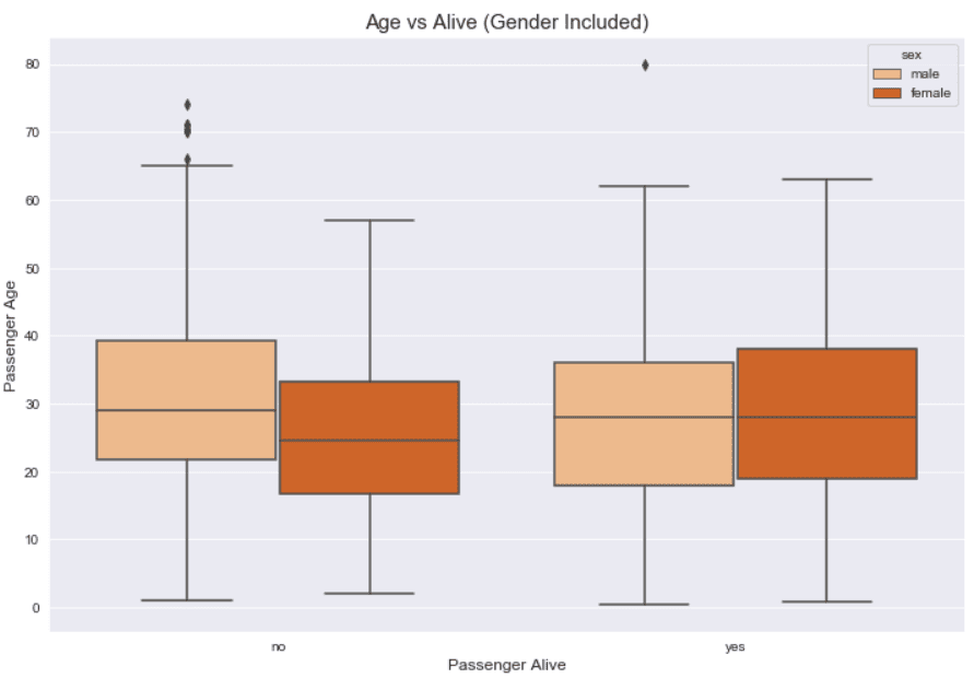
Finally, and probably most importantly, you can update the box plot labels by passing a string value to the xlabel and ylabel methods of the pyplot module of the Matplotlib library. Similarly, to change box plot title, simply pass the title string to the title method. The following script shows how to update the labels and title of a box plot.
sns.boxplot(x='alive', y='age', hue='sex', data=titanic_dataset, palette="Oranges")

plt.xlabel("Passenger Alive", fontsize= 12)
plt.ylabel("Passenger Age", fontsize= 12)
plt.title("Age vs Alive (Gender Included)", fontsize= 15)
Output:
This example is why we needed to import the Matplotlib into our Python script at the very beginning of this tutorial.
Conclusion
Seaborn boxplots are a great way to visualize the distribution of your data, including quartiles and median for a numeric data column. In this article you saw how to use the Python Seaborn library to plot and modify box plots using several examples.
If you enjoyed this tutorial, I hope you’ll subscribe using the form below. We’ll let you know when we have similar tutorials for you to try.

