A couple weeks ago, we showed you what data clustering is and how to cluster data using the k-means algorithm in Python’s Scikit-learn. In this tutorial, we’ll show you how to cluster data using the hierarchical clustering technique, which is another useful clustering technique.
There are two-types of hierarchical clustering algorithms: agglomerative and divisive. In this tutorial, we’ll be working with the agglomerative clustering algorithm.
How Agglomerative Clustering Works
Here are the steps performed during agglomerative clustering:
- Each point in the dataset is initially treated as an individual cluster. Hence, in the beginning the number of clusters is equal to the number of data points.
- Next, a cluster is formed by joining the two closest data points. Hence the number of clusters becomes N-1 where N is the number of total data points.
- Step 2 is repeated and more clusters are formed by joining the two closest data points or clusters, until one big cluster is formed.
- A threshold is selected for dividing one big cluster into the desired number of clusters using the distance between each sub-cluster. Dendrograms may be used to find this threshold.
Now that we understand the process, let’s learn how to implement hierarchical agglomerative clustering with the Python scikit-learn library.
Example of Agglomerative Clustering with Dummy Data
In this section, we’ll be clustering a dummy dataset. In the next section, we’ll walk through a real-world example of hierarchical clustering.
The following script imports the Python libraries we’ll need.
from sklearn.datasets import make_blobs
from sklearn.cluster import KMeans
from matplotlib import pyplot as plt

import numpy as np
import seaborn as sns
sns.set_style("darkgrid")
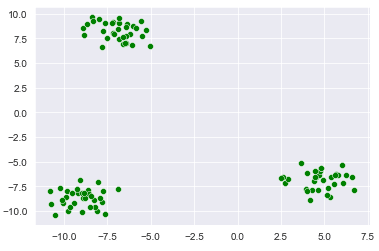
In the script below, the make_blobs() method from the sklearn.datasets module is used to create our dummy dataset. The dataset consists of 100 records divided into 3 clusters having an overall cluster standard deviation of 1.00. The script also plots the dummy dataset.
X, y = make_blobs(n_samples=100, centers=3, cluster_std = 1.00)
sns.scatterplot(x=X[:,0], y=X[:,1], c =["green"])
Output:
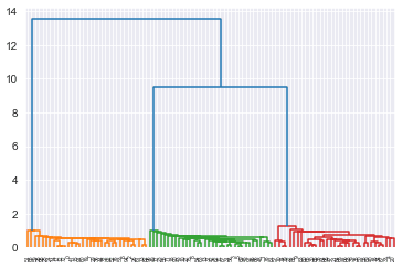
Okay, let’s see what a dendrogram for this dataset looks like. The dendrograms will show all the clusters in our dataset formed via agglomerative hierarchical clustering.
To plot a dendrograms, you can use the dendrogram and linkage classes from the scipy.cluster.hierarchy module. The unclustered dataset is passed to the linkage class constructor and the linkage class is passed to the dendrogram class constructor, as shown in the following script:
from scipy.cluster.hierarchy import dendrogram, linkage

dendrogram(linkage(X, 'single'),
            orientation='top',
            distance_sort='descending',
            show_leaf_counts=True)

plt.show()
Output:
The output shows all the clusters in the dataset. You can see three big dendrograms (in blue) and a set of many small dendrograms (in orange, green and red). The three big dendrograms correspond to the clusters with largest distances among them. The remaining dendrograms belong to the sub-clusters.
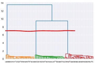
To divide the data into the desired number of clusters you have to draw a horizontal line across the the dendrograms. The number of dendrograms that the horizontal line passes through will be your number of clusters. A higher horizontal line results in a higher threshold value for the distance between the data points resulting in a lower number of clusters whereas if you lower the horizontal line, the number of clusters will increase. For example, in the figure below the red horizontal line passes through three dendrograms dividing the data into three clusters.
While you can plot dendrograms and manually divide your data into clusters if you have very small datasets, doing so on large datasets is not practical for hierarchical clustering. This is especially true because, even though you specified 3 clusters when making your dummy data, your manually-created dendrogram may only show 2 clusters depending on how close the clusters are.
In such cases, you can use AgglomerativeClustering class from the Python scikit-learn library.
To perform hierarchical clustering in scikit-learn, you need create an object of the AgglomerativeClustering class. You need to pass the number of clusters to the n_clusters attribute, the method of calculating distance to the affinity attribute and finally the method to calculate variance between data points using the linkage attribute. The linkage method we’re using in this tutorial is ward. You can study more about the ward method here.
To finally create clusters, you need to pass your dataset to the fit_predict() method of the agglomerative class instance.
The following script divides our dataset into 3 clusters.
from sklearn.cluster import AgglomerativeClustering

hc_model = AgglomerativeClustering(n_clusters=3, affinity='euclidean', linkage='ward')
hc_model.fit_predict(X)
Output:
The output shows the labels assigned to various data points in our dataset. You can see the data is either assigned a 0, 1 or 2, representing our 3 clusters.
array([1, 2, 1, 2, 0, 2, 1, 1, 2, 0, 2, 2, 1, 2, 1, 1, 0, 1, 2, 1, 0, 0,
       0, 2, 1, 1, 1, 2, 1, 1, 0, 2, 1, 0, 0, 0, 1, 2, 0, 0, 0, 1, 2, 2,
       1, 2, 2, 0, 2, 2, 0, 1, 1, 1, 2, 2, 2, 0, 0, 1, 1, 1, 2, 2, 0, 0,
       0, 0, 1, 2, 0, 2, 1, 1, 0, 2, 1, 2, 2, 0, 0, 2, 1, 0, 0, 0, 2, 2,
       0, 0, 2, 1, 1, 0, 1, 0, 2, 2, 1, 0], dtype=int64)
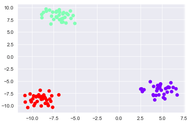
Finally, you can plot the clustered dataset using the following script.
#pring the data points
plt.scatter(x=X[:,0], y=X[:,1], c= hc_model.labels_, cmap='rainbow' )
In the output, you can see three distinct clusters. Output:
Real-world Example of Hierarchical Clustering
Customer Segmentation
Just like we did on our k-means clustering tutorial, we’re going to walk through a real-world example of hierarchical clustering where you’ll create customer segments based on their annual income in dollars, and their spending score (from 1 to 100).
The goal of this clustering task is to identify customers with a high income and a high spending score. These are the customers we should target in our marketing campaigns. The dataset for this section can be downloaded in the CSV format from this Github link and has been mirrored here.
The following script imports the libraries we’re going to need:
from sklearn.datasets import make_blobs
from sklearn.cluster import KMeans
from matplotlib import pyplot as plt

import numpy as np
import pandas as pd

import seaborn as sns
sns.set_style("darkgrid")
If you run into errors when trying these declarations, make sure you have scikit-learn, matplotlib, NumPy, seaborn and Pandas installed. Install them with these commands from your command prompt:
pip install numpy
pip install seaborn
pip install matplotlib
pip install scikit-learn
pip install pandas
The script below imports the dataset and displays its first five rows using the head() method:
X = pd.read_csv('https://raw.githubusercontent.com/krishnaik06/DBSCAN-Algorithm/master/Mall_Customers.csv')
X.head()
Output:
We’re only interested in the “Annual Income (k$)” and the “Spending Score (1-100)” columns so we’ll keep these columns and filter out the rest of the columns.
X = X.filter(["Annual Income (k$)", "Spending Score (1-100)" ], axis = 1)Let’s now plot a scatter plot to see the customer’s annual income against their spending score.
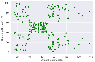
sns.scatterplot(data = X, x="Annual Income (k$)", y= "Spending Score (1-100)", c = ["green"])Output:
From the output you can see that customers are roughly divided into 5 segments (one cluster at each of the four corners, and one cluster in the middle).
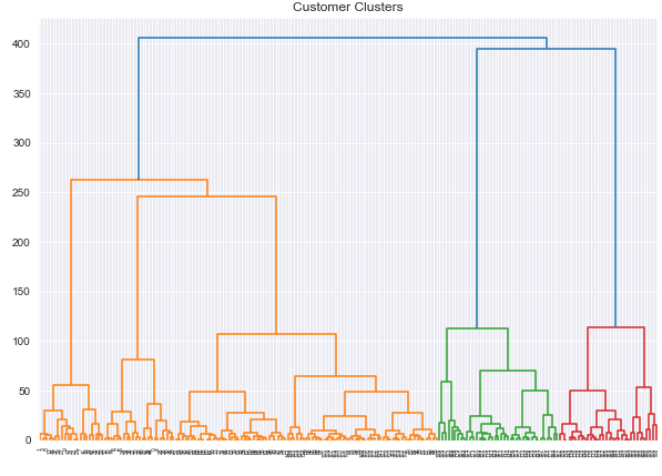
Let’s plot the dendrograms for our dataset and see how our data is clustered via the agglomerative clustering algorithm.
import scipy.cluster.hierarchy as shc

plt.figure(figsize=(10, 7))
plt.title("Customer Clusters")
cd = dendrogram(linkage(X, method='ward'))
In the output below, you can broadly see five big dendrograms followed by multiple smaller dendrograms.
Output:
Now that we have a couple visuals of our data clusters, we’re going to use the AgglomerativeClustering class from the scikit-learn library to divide our data into 5 clusters. Okay, go ahead and run the script below:
from sklearn.cluster import AgglomerativeClustering

model = AgglomerativeClustering(n_clusters=5, affinity='euclidean', linkage='ward')
model.fit_predict(X)
Output:
array([4, 3, 4, 3, 4, 3, 4, 3, 4, 3, 4, 3, 4, 3, 4, 3, 4, 3, 4, 3, 4, 3,
       4, 3, 4, 3, 4, 3, 4, 3, 4, 3, 4, 3, 4, 3, 4, 3, 4, 3, 4, 3, 4, 1,
       4, 1, 1, 1, 1, 1, 1, 1, 1, 1, 1, 1, 1, 1, 1, 1, 1, 1, 1, 1, 1, 1,
       1, 1, 1, 1, 1, 1, 1, 1, 1, 1, 1, 1, 1, 1, 1, 1, 1, 1, 1, 1, 1, 1,
       1, 1, 1, 1, 1, 1, 1, 1, 1, 1, 1, 1, 1, 1, 1, 1, 1, 1, 1, 1, 1, 1,
       1, 1, 1, 1, 1, 1, 1, 1, 1, 1, 1, 1, 1, 2, 1, 2, 1, 2, 0, 2, 0, 2,
       1, 2, 0, 2, 0, 2, 0, 2, 0, 2, 1, 2, 0, 2, 1, 2, 0, 2, 0, 2, 0, 2,
       0, 2, 0, 2, 0, 2, 1, 2, 0, 2, 0, 2, 0, 2, 0, 2, 0, 2, 0, 2, 0, 2,
       0, 2, 0, 2, 0, 2, 0, 2, 0, 2, 0, 2, 0, 2, 0, 2, 0, 2, 0, 2, 0, 2,
       0, 2], dtype=int64)
The output array shows our data is split into 5 clusters, represented by a 0, 1, 2, 3 or 4.
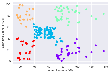
Finally, the script below plots the customers segmented into these same 5 clusters via the agglomerative clustering algorithm.
plt.scatter(x=X["Annual Income (k$)"], y=X["Spending Score (1-100)"],  c= model.labels_, cmap='rainbow' )
plt.xlabel("Annual Income (k$)")
plt.ylabel("Spending Score (1-100)")
Output:
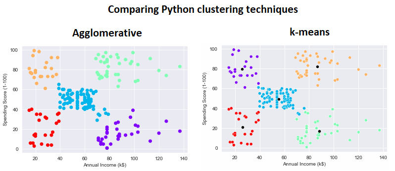
Ignoring the differences in color, you can see there are some slight differences in how the agglomerative clustering algorithm clustered the data relative to the k-means clustering algorithm from our last clustering tutorial. Pay attention to the datapoints on the lower right and upper left of the central blue cluster:
If you enjoyed this tutorial and real-world example, subscribe using the form below and we’ll walk you through even more Python examples.
