If you’ve worked with Python’s Matplotlib, Seaborn and Pandas libraries, you know how to make static plots. However, these libraries might not be enough if you want interactive features, like hovering, zooming and dragging.
This is where the Python Bokeh library comes into play. Bokeh allows you to add interactivity to your data visualization. You can zoom, drag and hover on the visualizations to display dynamic data.
This tutorial teaches you how to use the Python Bokeh library. You’ll also study the Pandas-Bokeh library, a Bokeh library wrapper for the popular Python Pandas library.
Installing Python Bokeh library
For default Python distributions, you can use the following pip command to install the Bokeh library.
pip install bokehIf you are running an anaconda distribution, run the following command to install the Bokeh library.
conda install bokehPlotting with the Bokeh Library
This section will show how to make charts with the Python Bokeh library. In a later section, we’ll explain how to plot charts with the Pandas-Bokeh library.
A Basic Example
To plot a chart with Bokeh, you need to import a figure object, then import the output_notebook and show functions from the bokeh.plotting module.
If you want to display the chart inside a Python notebook, you must call the output_notebook() function. Otherwise, the plot will be displayed in your default browser.
Next, you need to create a figure object. You can optionally pass the width and height of your plot here. Once this is done, you can plot any plot using this figure object.
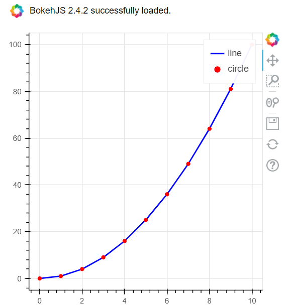
For example, to make a line plot, use the line() function and pass it the x and y coordinates of your line. You can then pass the line width, color, and the label for the legend to line_width, color, and legend_label attributes, respectively.
Setting the legend.click_policy to hide allows you to hide legends by clicking on the legend values. For example, clicking the line legend will hide the line plot, in the output of the following script.
Finally, call the show() function on the figure object to display the chart.
Here’s a full example:
from bokeh.plotting import figure, output_notebook, show
import numpy as np


x = list(range(11))
y = [i * i for i in x]

output_notebook()


f = figure(plot_width = 400,
           plot_height = 400)


f.line(x, y,
       line_width = 2,
       color = "blue",
       legend_label = 'line')

f.circle(x, y,
         size=5,
         color='red', legend_label='circle')

f.legend.click_policy='hide'

show(f)
Output:
When you run this script yourself, you can drag, zoom, and save the above plot using the controls displayed on the right-hand side of the plot.
Plotting Bokeh Plots using Pandas DataFrames
A useful feature of the Bokeh library is that it allows you to plot data from a Pandas dataframes. Let’s see an example.
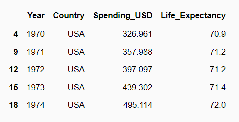
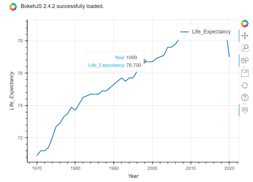
The script below imports the healthexp dataset from the Python seaborn module. It shows the spending in USD vs the average life expectancy per country from years 1970 to 2020.
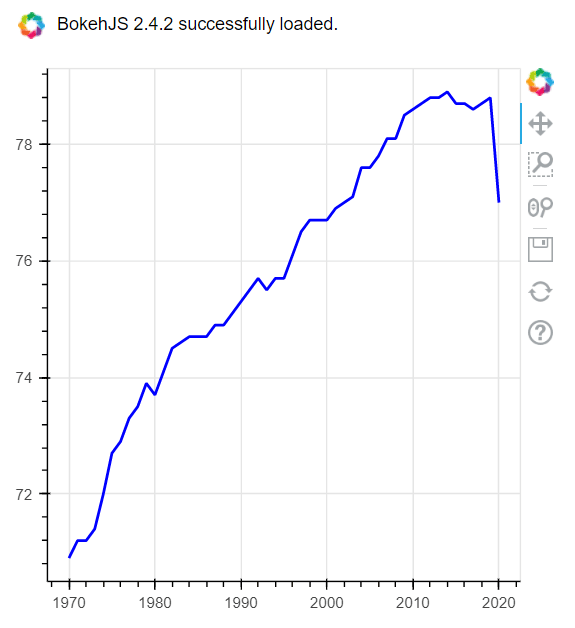
We’re going to filter the records for the US, then we’ll plot a line plot that displays yearly average life expectancy.
To do so, you can simply pass the Year and Life_Expectancy columns from the dataframe to the x and y attributes of the line() function.
import seaborn as sns
dataset = sns.load_dataset('healthexp')
dataset = dataset[dataset['Country'] == 'USA']
dataset.head()
Output:
from bokeh.plotting import figure, output_notebook, show
import numpy as np

output_notebook()


f = figure(plot_width = 400,
           plot_height = 400)


f.line(dataset['Year'],
       dataset['Life_Expectancy'],
       line_width = 2,
       color = "blue")

show(f)
Output:
The previous example is good way of integrating Pandas with Bokeh. However, for more control, Bokeh allows you to integrate dataframes with Bokeh via the ColumnDataSource object.
To use this method, you need to pass your Pandas dataframe to the ColumnDataSource object, which is then passed to the source attribute of your Bokeh plotting function. You can then access column names of a Pandas dataframe without referring to the dataframe name.
Here is an example:
from bokeh.plotting import figure, output_notebook, show
from bokeh.models import ColumnDataSource
import numpy as np
import seaborn as sns

output_notebook()

f = figure(plot_width = 400,
           plot_height = 400)

source = ColumnDataSource(dataset)

f.line(source = source,
       x = 'Year',
       y = 'Life_Expectancy',
       line_width = 2,
       color = "blue")

show(f)
Output:
Bokeh bar plots
The vbar() function allows you to plot vertical bar plots in Bokeh. Let’s take a look.
The script below returns a header that contains names of the different travel classes for the titanic ship that sank in 1912. The dataset shows the average values for age, fare, survival percentage, etc., for first, second, and third classes. We’re going to use this dataset to test our Bokeh bar plots.
import seaborn as sns
dataset = sns.load_dataset('titanic')
dataset = dataset.groupby(['class']).mean()
dataset = dataset.rename_axis('class').reset_index()
dataset.head()
Output:
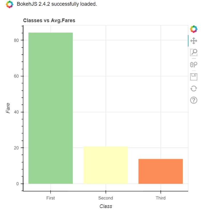
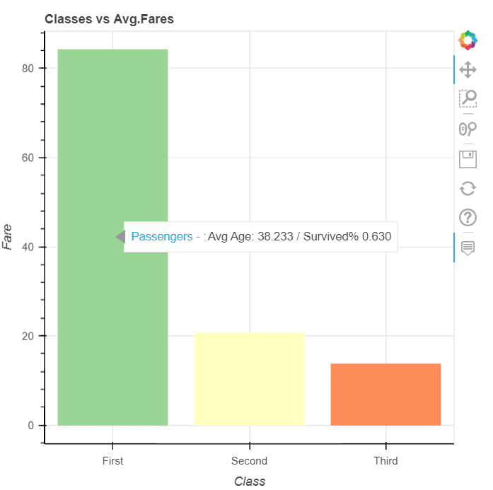
This next script plots a bar plot showing the average fare for different classes.
You need to pass the the column name to the x_range attribute of the figure object. In addition, you can create a color map for different bars using the factor_cmap oject.
Finally, you need to pass the values for the x-axis to the x attribute and the values for the bars to the top attribute of the vbar() function.
from bokeh.plotting import figure, output_notebook, show
from bokeh.models.tools import HoverTool
from bokeh.models import ColumnDataSource
from bokeh.palettes import Spectral3
from bokeh.transform import factor_cmap


output_notebook()

source = ColumnDataSource(dataset)

classes = source.data['class'].tolist()

color_map = factor_cmap(field_name='class',
                        palette=Spectral3,
                        factors=classes)

f = figure(plot_width = 500,
           plot_height = 500,
           x_range=classes)

f.vbar(source=source,
       x = 'class',
       top = 'fare',
       width=0.80,
       color=color_map
      )

f.title.text ='Classes vs Avg.Fares'
f.xaxis.axis_label = 'Class'
f.yaxis.axis_label = 'Fare'


show(f)
Output:
Adding Hovers to Plots
So far we’ve made interactive plots that allow you to drag, zoom and even hide/unhide values by clicking them in our legend. What if we want to hover over datapoints to display information about the data? You can display plot information on hover using the HoverTool object. You need to pass the dataframe values to display as a string to the tools attribute. You can use the @ sign to access a column’s value.
For instance, the script below displays the average and survival percentage of passengers for each travel class. Notice, that means we’re not limited to only displaying data related to the actual values we’re plotting. We can display whatever values we want from our dataframe while hovering over the bars in our Bokeh plots!
from bokeh.plotting import figure, output_notebook, show
from bokeh.models.tools import HoverTool
from bokeh.plotting import figure, output_notebook, show
from bokeh.models.tools import HoverTool
from bokeh.models import ColumnDataSource
from bokeh.palettes import Spectral3
from bokeh.transform import factor_cmap


output_notebook()

source = ColumnDataSource(dataset)

classes = source.data['class'].tolist()

color_map = factor_cmap(field_name='class',
                        palette=Spectral3,
                        factors=classes)

f = figure(plot_width = 500,
           plot_height = 500,
           x_range=classes)

f.vbar(source=source,
       x = 'class',
       top = 'fare',
       width=0.80,
       color=color_map
      )

f.title.text ='Classes vs Avg.Fares'
f.xaxis.axis_label = 'Class'
f.yaxis.axis_label = 'Fare'


hover = HoverTool()
hover.tooltips = [
    ("Passengers - ", "Avg Age: @age / Survived% @survived")]

hover.mode = 'vline'

f.add_tools(hover)

show(f)
Output:
Scatter plots
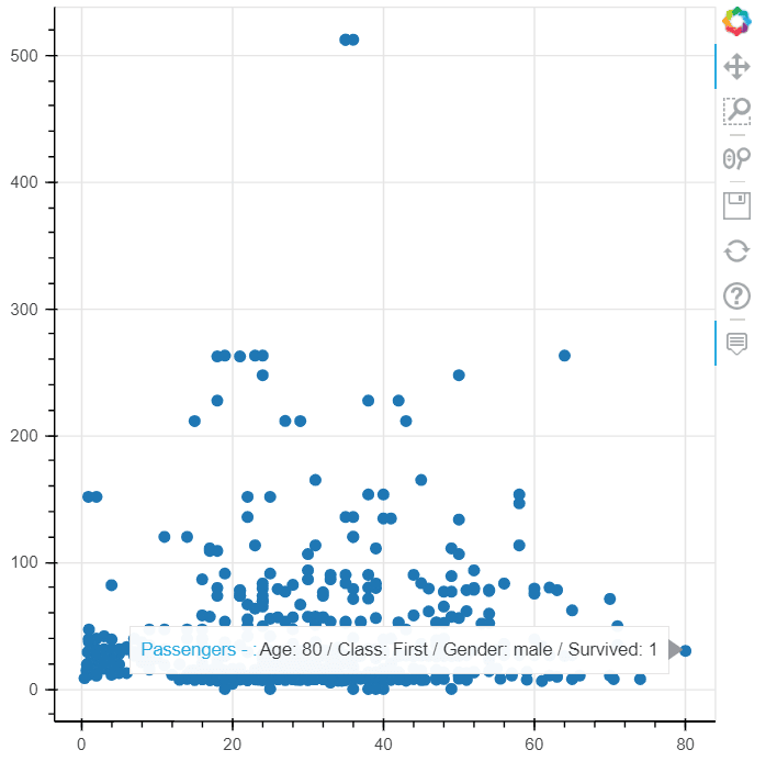
The circle() function allows you to plot a scatter plot in Bokeh, as the following script demonstrates.
from bokeh.plotting import figure, output_notebook, show
from bokeh.models.tools import HoverTool
from bokeh.models import ColumnDataSource

import seaborn as sns

dataset = sns.load_dataset('titanic')

source = ColumnDataSource(dataset)

f = figure(plot_width = 500,
           plot_height = 500)

f.circle(source=source,
       x = 'age',
       y = 'fare',
       size=7,
      )

hover = HoverTool()
hover.tooltips = [
    ("Passengers - ", "Age: @age / Class: @class / Gender: @sex / Survived: @survived")]

hover.mode = 'vline'

f.add_tools(hover)

show(f)
Output:
Making Things Easier with the Pandas-Bokeh library
Integrating Bokeh with Pandas manually can be cumbersome. The Pandas-Bokeh library makes it seamless. Pandas-Bokeh is a Bokeh library wrapper for Pandas.
Installing Pandas-Bokeh
You can install the Pandas-Bokeh library with the following pip command.
pip install pandas-bokehOnce installed, you need to import the pandas_bokeh module. If you want to display the charts in a Python notebook, you must call the pandas_bokeh.output_notebook() function.
The process is very similar to plotting with default Pandas dataframes. For example, to plot a line plot with a Pandas dataframes, you would call the dataframe.plot.line() function. To plot with Pandas-Bokeh, you’ll call dataframe.plot_bokeh.line(). The rest of the process remains the same, but with the Pandas-Bokeh library, you’ll get a beautiful interactive plot instead of a static figure.
Here’s an example demonstrating how to plot a line plot with the Pandas-Bokeh library.
import pandas_bokeh
pandas_bokeh.output_notebook()

import seaborn as sns

import seaborn as sns
dataset = sns.load_dataset('healthexp')
dataset = dataset[dataset['Country'] == 'USA']


dataset.plot_bokeh.line(x='Year', y=['Life_Expectancy']);
Output:
You can see, even with this short code snippet, hovering is already supported.
The other option for creating plots is to call the plot_bokeh() function and pass the chart type to the kind attribute. For instance, the following line of code will return the same output as the previous script:
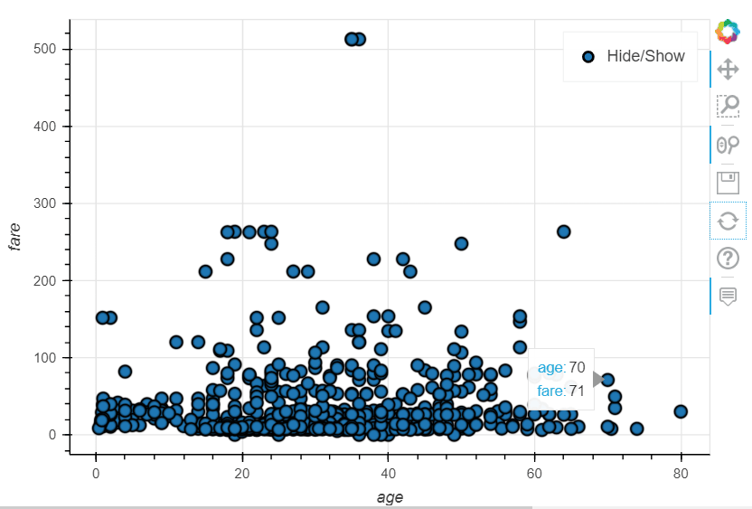
dataset.plot_bokeh(kind = 'line', x='Year', y=['Life_Expectancy']);In the same way, you can plot a scatter plot with the plot_bokeh.scatter()function.
import pandas_bokeh
pandas_bokeh.output_notebook()

import seaborn as sns

dataset = sns.load_dataset('titanic')

dataset.plot_bokeh.scatter(x='age', y=['fare']);
Output:
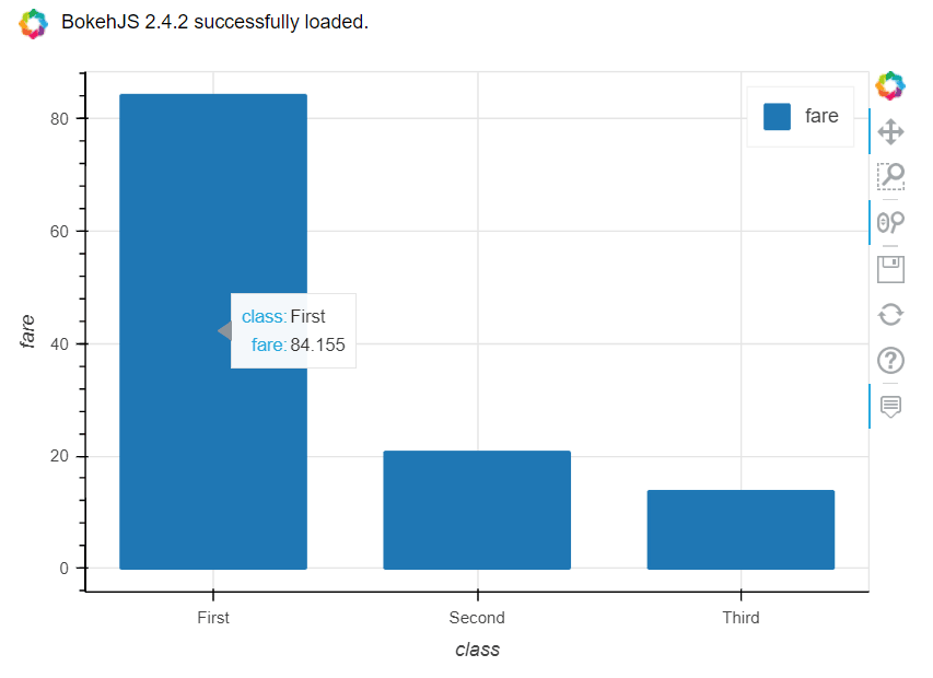
For a bar plot with Pandas-Bokeh, you can call the plot_bokeh.bar() function, as the following script demonstrates.
import pandas_bokeh
pandas_bokeh.output_notebook()

import seaborn as sns
dataset = sns.load_dataset('titanic')
dataset = dataset.groupby(['class']).mean()
dataset = dataset.rename_axis('class').reset_index()

dataset.plot_bokeh.bar(x='class', y=['fare']);
Output:
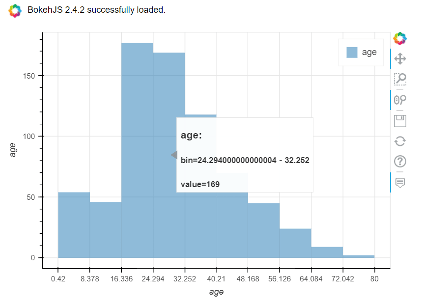
You can plot interactive histograms using the plot_bokeh.hist() function, as well. For example, the script below plots a histogram for the age column of the titanic dataset. Notice the similarities between this pandas-bokeh code and the code we used when using Pandas to create histograms from Pandas DataFrames
import pandas_bokeh
pandas_bokeh.output_notebook()

import seaborn as sns
dataset = sns.load_dataset('titanic')

dataset = dataset.filter(['age'], axis = 1).dropna()

dataset.plot_bokeh.hist(bins = 10)
Output:
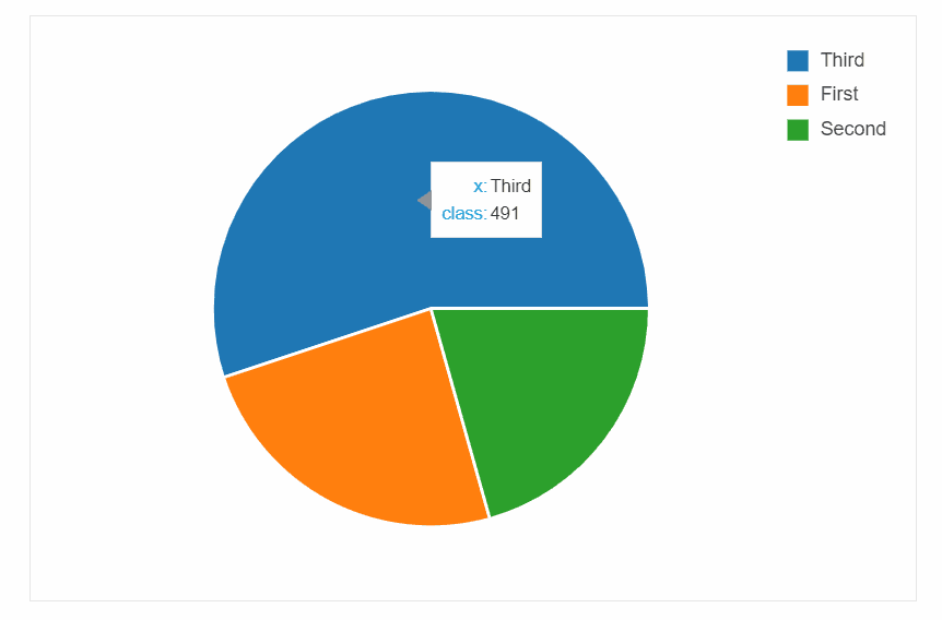
Finally, the following script demonstrates how to plot a pie chart with the Pandas-Bokeh library.
import pandas_bokeh
pandas_bokeh.output_notebook()

import seaborn as sns
dataset = sns.load_dataset('titanic')

dataset['class'].value_counts().plot_bokeh(kind = 'pie')
Output:
Data visualization is an important part, and one of the funnest parts, of programming with Python. For my data visualization ideas, enter your email address in the form below:
