Introduction to Pandas Histograms
Histograms are a powerful tool for analyzing the distribution of data. Plots like histograms that characterize the distribution of individual variables or features are vital for data analysis because they help reveal patterns in the input data. Pandas DataFrames that contain our data come pre-equipped with methods for creating histograms, making preparation and presentation easy.
We can create histograms from Pandas DataFrames using the pandas.DataFrame.hist DataFrame method, which is a sub-method of pandas.DataFrame.plot. Pandas uses the Python module Matplotlib to create and render all plots, and each plotting method from pandas.DataFrame.plot takes optional arguments that are passed to the Matplotlib functions. In this tutorial, we will cover the essential tools and options for plotting histograms from Pandas DataFrames, but you should be aware that many more options (e.g. plot color, orientation, size, etc.) are available to be passed to the Matplotlib via pandas.DataFrame.plot.hist.
If you’re trying to find out how to plot your Pandas DataFrame data in a histogram, we’re going to assume you’ve already built your Pandas DataFrame. We’ve already built ours, too! To illustrate creating histograms, we’re going assume we have the following DataFrame
df.info()
> <class 'pandas.core.frame.DataFrame'>
> RangeIndex: 746 entries, 0 to 745
> Data columns (total 3 columns):
> Test_1    746 non-null float64
> Test_2    746 non-null float64
> Type      746 non-null int64
> dtypes: float64(2), int64(1)
> memory usage: 17.6 KB

df.head()
>        Test_1     Test_2  Type
> 0   85.868553  88.160763     2
> 1   88.017580  89.946783     3
> 2   76.811083  82.444485     3
> 3  100.000000  68.406203     3
> 4   94.719547  63.994755     2
Here we have two features,
If we would like to create a fast and simple histogram for exploratory analysis, we can use the simple pandas.DataFrame.hist 1 method, like this:
df.hist()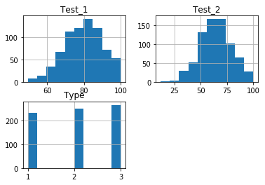
This command produced histograms for each of the 3 features we specified. However, if we want to perform additional analysis by altering the plots, we will have to specify additional options when calling our histograms.
Single Histogram from a Pandas DataFrame
The simple df.hist() method above plotted histograms of every feature in the DataFrame. If we wish to only examine a subset of the features, or even look at only one, then we can specify what we want to plot using the columns parameter of the df.hist() method. The columns feature takes either a string or list of strings of columns names:
df.hist(column="Test_1") # Plot a single column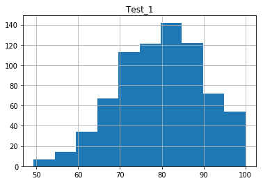
We’ll demonstrating plotting multiple histograms with a list of strings shortly.
Modifying Histogram Bin Sizes
The bins, or bars of the histogram plot, can be adjusted using the bins option. This option can be tuned depending on the data, to see either subtle distribution trends, or broader phenomena. Which bin size to use heavily depends on the data set you use, therefore it is important to know how to change this parameter. The default number of bars is 10.
df.hist(column="Test_1", bins=5) # Plotting 5 bins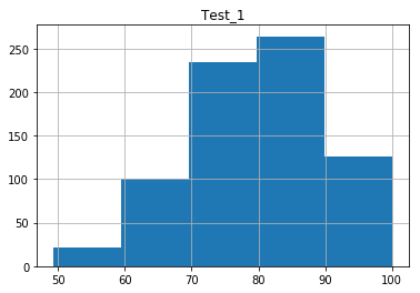
df.hist(column="Test_1", bins=30) # Plotting 30 bins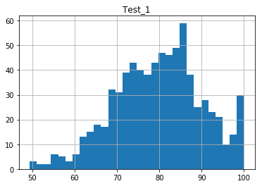
Multiple Pandas Histograms from a DataFrame
The columns feature can take a list of column names to produce separate plots for each chosen column:
df.hist(column=["Test_1", "Test_2"]) # Plot specific columns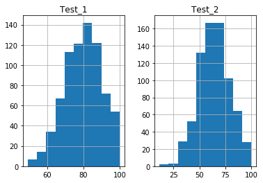
The histograms will be plotted side-by-side for you. Notice the axes are automatically adjusted by default, so the scales may be different for each Pandas DataFrame histogram.
Modifying Histogram Axes
Again, you may notice in the above plots, the x and y axes are not the same. Different scales can complicate side-by-side data comparisons, so we would prefer to set both of the axes to the same range and scale. We can do this with the sharex and sharey options. These options accept boolean values, which are
df.hist(column=["Test_1", "Test_2"], sharex=True) # Share only x axis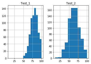
df.hist(column=["Test_1", "Test_2"], sharex=True, sharey=True) # Share x and y axis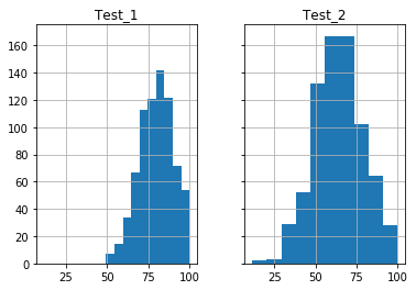
Note: Be careful when comparing histograms this way. The range over which bins are set in the
Plotting Multiple Features in One Plot
Suppose we wanted to present the histograms on the same plot in different colors. To do this, we will have to slightly change our syntax and use the pandas.DataFrame.plot.hist method. This plot.hist method contains more specific options for plotting. It does not, however, contain a columns option, therefore we will have to slice the DataFrame prior to calling the method.
Recall our DataFrame had 3 columns of data. To only plot the
df[["Test_1", "Test_2"]].plot.hist() # Note slicing is performed on df itself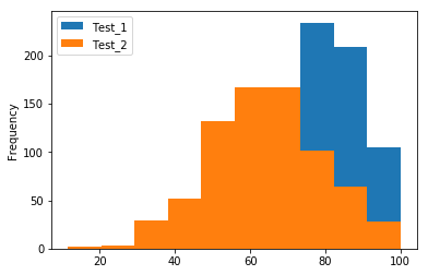
This code snippet plotted both histograms on the same plot, but the second plot “blocks” the view of the first. We can solve this problem by adjusting the alpha transparency option, which takes a value in the range [0,1], where 0 is fully transparent and 1 is fully opaque.
df[["Test_1", "Test_2"]].plot.hist(alpha=0.4) # Plot at 40% opacity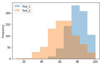
Now we can see the intersection of the plots. It’s worth noting that not all the plotting features are available in the Pandas plotting methods. Be aware that if the Pandas methods do not have the options you wish to apply to your plots, you’ll have to resort to using manual Matplotlib functions.
Grouping Pandas data with 'by' Option
We’re going to end this tutorial by talking about something a little more complicated. Suppose our data is grouped according to some feature of the data, or that our data exists in categories. In this case, we may want to determine the distributions of each type separately. In our example data, these categories are specified by the
We can create multiple plots of data grouped by a feature using the by option of the pandas.DataFrame.hist method. The by option will take an object by which the data can be grouped. This can include a string of the column name you use to separate the data. This is exactly what we’re doing in our final example:
df.hist(by="Type", column="Test_1")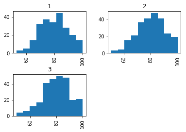
Histograms are just one way of plotting the distribution of data. For another helpful method, check out our tutorial on creating Pandas Density Plots, which plot the normalized frequency of occurrences in our dataframe.
On a related note, you can also plot a normalized histogram by setting the normed argument to True, like this:
df["Test_1"].plot.hist(normed=True)Did you find this free tutorial helpful? You can find more great Python tips and tutorials by subscribing to our systematic Python training program below. Not ready to join? Share this article with your friends, classmates, and coworkers on Facebook and Twitter, instead! When you spread the word on social media, you’re helping us grow so we can continue to provide free tutorials like this one for people around the world.
-
Notice that this fast method of histogram creation is the method
pandas.DataFrame.hist, rather thanpandas.DataFrame.plot.hist(with theplotmethod explicitly included). Thepandas.DataFrame.histmethod contains default settings that are more applicable to fast, though simple, exploratory analysis. Thepandas.DataFrame.plot.histwill be used when we wish to specify more options for plotting. See the Manual Page for additional information. ↩
