Introduction to Pandas Boxplots
A boxplot, or box-and-whisker plot, is a popular tool for visualizing the distribution of multiple sets of data at once. Like histograms and density plots, boxplots show the distribution of a given set of data. Unlike histograms and density plots, though, boxplots present a simplified illustration of the data. Boxplots are designed to help you quickly identify important quartile boundaries, which is valuable when you’re analyzing several datasets at once.
Pandas DataFrames come pre-equipped with methods of creating boxplots, making their preparation and presentation easy. We can create boxplots from Pandas DataFrames using the pandas.DataFrame.boxplot DataFrame method, which is a sub-method of matplotlib.pyplot.boxplot.
Pandas uses the Python module Matplotlib to create and render all plots, and each plotting method from matplotlib.pyplot.boxplot takes optional arguments that are passed to the Matplotlib functions. In this tutorial, we will cover the essential tools and options for plotting boxplots, but you should be aware that many more options (e.g. plot color, size, etc.) are available to be passed to the Matplotlib via matplotlib.pyplot.boxplot.
To illustrate creating boxplots, we will assume we have the following DataFrame df containing test grades already available within our Python environment:
df.info()
> <class 'pandas.core.frame.DataFrame'>
> RangeIndex: 746 entries, 0 to 745
> Data columns (total 3 columns):
> Test_1    746 non-null float64
> Test_2    746 non-null float64
> Type      746 non-null int64
> dtypes: float64(2), int64(1)
> memory usage: 17.6 KB

df.head()
>        Test_1     Test_2  Type
> 0   85.868553  88.160763     2
> 1   88.017580  89.946783     3
> 2   76.811083  82.444485     3
> 3  100.000000  68.406203     3
> 4   94.719547  63.994755     2
Here we have two features, Type.
If we would like to create a fast set of boxplots for exploratory analysis, we can use the simple pandas.DataFrame.boxplot method:
df.boxplot()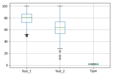
This command produced boxplots for each of the 3 features we specified. Notice how it even creates a boxplot for our
So how do we make it so the Pandas boxplot doesn’t try to plot this extra column? To alter the default plots, we will have to specify additional options.
Single Boxplot from a Pandas DataFrame
The simple df.boxplot() method above plotted boxplots of every feature in the DataFrame. If we wish to only examine a subset of the features, or even look at only one, then we should specify the column argument of the df.boxplot() method. The column argument takes either a string or list of strings of columns names:
df.boxplot(column="Test_1") # Plot a single column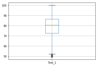
Notice how the y-axis is autosized to fit the data from our
Modifying Boxplot Orientation
Occasionally boxplots are plotted horizontally to show the spread of data over the x-axis. The orientation of the boxplots is given by the vert option, which accepts a boolean value to specify that the boxplots should be plotted with a vertical orientation. The default value is vert=False.
df.boxplot(column="Test_1", vert=False) # Plot a single column horizontally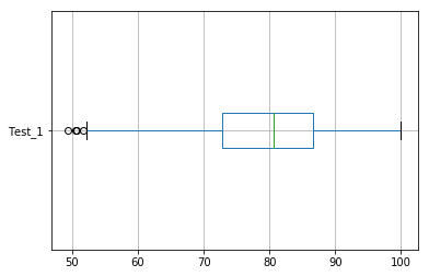
Modifying Boxplot Width
Sometimes the box width of the output boxplot may need to be changed to fully express the given data. To manually change the width of the boxes, the widths option can be adjusted to a floating point width. For example, we can expand the width of our boxplot with the following:
df.boxplot(column="Test_1", widths=0.5) # Change width of the boxes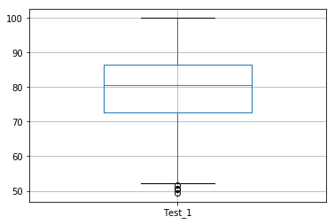
Modifying Boxplot Calculation Options
There are numerous ways to change how Matplotlib calculates and plots the boxplots, which are detailed in the manual page . However, it is highly recommended to use the default values, as box and whisker demarcations are standard across applications, and changing plotting parameters can grossly mislead your audience. Changes to these values should only be performed to bring your boxplots into a standard expected by your audience.
Multiple Pandas Boxplots from a DataFrame
The column feature can also take a list of column names and produce separate plots for each chosen column. Take a look at this example:
df.boxplot(column=["Test_1", "Test_2"]) # Plot specific columns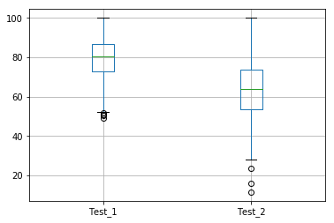
In the example below, we told Pandas to create a boxplot for both
Grouping Pandas data with 'by' Option
Suppose our data is typed according to some common feature of the data, or that our data exists in categories. In these cases, we may want to determine the distributions of each type separately. Recall that in our example data the categories are given by the by option of the pandas.DataFrame.boxplot method.
The by option will take an object by which the data can be grouped. This can include a string of the column name specifying how you want to separate the data:
df.boxplot(by="Type", column="Test_1")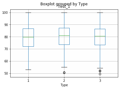
We can also create multiple plots of different features based on a common by column by specifying additional features within the column option.
df.boxplot(by="Type", column=["Test_1", "Test_2"])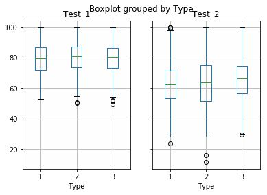
Instead of plotting our
Did you find this free tutorial helpful? Share this article with your friends, classmates, and coworkers on Facebook and Twitter! When you spread the word on social media, you’re helping us grow so we can continue to provide free tutorials like this one for years to come.
