Data labeling is the process if taking raw data and adding one or more meaningful bits of information to it, like whether an image shows the face of a person. As you can imagine, data labeling is a time-consuming task so most data arrives unlabeled. Fortunately, several statistical clustering techniques have been developed that cluster data into groups based on similar characteristics. Data, once clustered, can be used to gain important insights and train supervised machine learning algorithms.
K-means clustering is one such technique. K-means clustering is an unsupervised machine learning algorithm which allows you to cluster data based on Euclidean or Manhattan distance between the data points in your dataset. Today we’re going to explain how it works and we’ll walk through a real-world example.
How k-means Clustering Works
To perform k-means clustering, you need to follow a specific process. The following steps are used to cluster data via the k-means clustering algorithm:
- Select optimal value for K which will be the number of clusters
- Randomly assign centroid values to each of your clusters
- Find the distance (Euclidean or Manhattan) between all the data points and centroids and assign the data point to the cluster of the nearest centroid
- Calculate the mean values for all the coordinates of data points in all the clusters. Update the coordinate values for the centroids with the corresponding clusters mean values.
- Repeat steps 3-4 until the new centroid values for all the clusters become the same as the previous centroid values.
k-means Clustering Example with Dummy Data
Alright, let’s run through an example. In this section, we’ll use the scikit-learn library to perform k-means clustering on a dummy dataset. In the next section, we’ll show you a real-world example of k-means clustering.
The following script imports all our required libraries. The KMeans class from the sklearn.cluster module from the Scikit-learn library is used for k-means clustering. You can see that the class is imported in the following script. The make_blobs() method from the sklearn.datasets module, which is also imported in the following script, is used to generate dummy data.
from sklearn.datasets import make_blobs
from sklearn.cluster import KMeans
from matplotlib import pyplot as plt

import numpy as np
import seaborn as sns
sns.set_style("darkgrid")
If you run into errors on these declarations, you’ll need to make sure you have scikit-learn, matplotlib, NumPy and seaborn installed. If you don’t, you can install them with these commands from your command prompt:
pip install numpy
pip install seaborn
pip install matplotlib
pip install scikit-learn
We’re going to use the pandas library later for our real-world example so you might as well make sure you have it installed, as well:
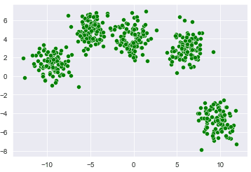
pip install pandasThis next block of code creates a dummy dataset of 100 records. The dataset consists of 2 features and is divided into 5 clusters having an overall cluster standard deviation of 1.00. The script also plots our dummy dataset, using seaborn. Your plot will be different, but you should still see some clustering in the dummy dataset. If you’re not using Jupyter Notebook, you can display your plots by adding plt.show() to the bottom of this code block (or any code block where we say we’re creating a plot).
X, y = make_blobs(n_samples=500, centers=5, cluster_std = 1.00)
sns.scatterplot(x=X[:,0], y=X[:,1], c =["green"])
Output:
You can eyeball from the above output that our data is divided into 5 clusters. Let’s now use the k-means clustering algorithm to see if the clustering algorithm also creates the same clusters for us as we see in the above screenshot.
To train a k-means clustering algorithm, you first need to create an object of the KMeans class and pass the value for K to the n_clusters attribute. Next, you need to call the fit() method and pass it the dataset you want to cluster. Look at the following script for reference.
model = KMeans(n_clusters=5)
model.fit(X)
Output:
KMeans(n_clusters=5)And that’s pretty much it. You probably can’t tell but in just a couple of lines of code, we’ve trained our scikit-learn k-means algorithm to create clusters for our data.
To see the cluster centers (also called centroids), we’ll use the cluster_centers_ attribute. This next line of code prints the cluster centers for all five of the clusters in our dummy dataset.
print(model.cluster_centers_)Output:
[[-0.16576781  4.07675775]
 [ 9.60287845 -4.7550837 ]
 [-4.91148837  4.91774862]
 [ 6.09044751  3.04444992]
 [-9.45897178  1.35667948]]
You can plot the cluster centers with the following script:
plt.scatter(model.cluster_centers_[:, 0], model.cluster_centers_[:, 1], s=100, c='black')Output:
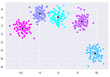
You can see that the cluster centers identified by the k-means clustering algorithm are actually in the middle of the clusters that we identified with our naked eyes. This is great!
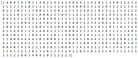
Data points belonging to different clusters are assigned labels by the k-means clustering algorithm in Scikit-learn. To see these label values, you can use the labels_ attribute of your k-means clustering model. In the output below, you’ll see the cluster labels for 500 data points in our dummy dataset. The cluster labels start from 0 to one less than the total number of clusters.
print(model.labels_)Output:
Finally, you can plot the data points belonging to different clusters, along with the cluster centroids using the following block of code:
sns.scatterplot(x=X[:,0], y=X[:,1], c= model.labels_, cmap='cool' )

sns.scatterplot(x=model.cluster_centers_[:, 0], y=model.cluster_centers_[:, 1], c=['black'])
Output:
You can distinctly see the five different clusters identified by the scikit-learn k-means clustering algorithm.
Real-world k-means Clustering Example
Customer Segmentation
Now we’re going to look at a real-world example of k-means clustering where we’ll create customer segments based on their annual income and a metric we’ll call spending score (from 1 to 100). In the dataset, the customers who spend more are assigned a higher score compared to customer who spend less.
Our goal is to identify customers with high income and high spending score. These are the customers that we can target more in our marketing campaigns to maximize our revenue. The dataset for this section for this example was originally pulled from this Github link and has been mirrored here, in case it ever goes down.
Let’s learn how to do customer segmentation using the scikit-learn k-means clustering algorithm.
The following script imports our required libraries:
from sklearn.datasets import make_blobs
from sklearn.cluster import KMeans
from matplotlib import pyplot as plt

import numpy as np
import pandas as pd

import seaborn as sns
sns.set_style("darkgrid")
Run the script below to import the dataset and display its first five rows:
X = pd.read_csv('https://raw.githubusercontent.com/krishnaik06/DBSCAN-Algorithm/master/Mall_Customers.csv')
X.head()
Output:
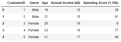
The output above shows that the dataset contains five columns. We are only interested in the “Annual Income (k$)” and the “Spending Score (1-00)” columns so we’ll filter these columns using pandas and remove the rest of the columns.
X = X.filter(["Annual Income (k$)", "Spending Score (1-100)" ], axis = 1)Let’s now create a seaborn scatter plot to see the customer’s annual income versus their spending score.
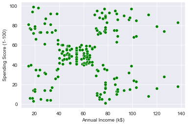
sns.scatterplot(data = X, x="Annual Income (k$)", y= "Spending Score (1-100)", c = ["green"])Output:
From the output you can see that customers are roughly divided into 5 segments - one cluster at each of the four corners and one cluster in the middle.
So, how will the k-means algorithm cluster our data?
Run the following script to create 5 clusters.
model = KMeans(n_clusters= 5)
model.fit(X)
Output:
KMeans(n_clusters=5)To see the cluster centroids as a list, add the following line of code.
print(model.cluster_centers_)Output:
[[25.72727273 79.36363636]
 [55.2962963  49.51851852]
 [88.2        17.11428571]
 [86.53846154 82.12820513]
 [26.30434783 20.91304348]]
The above output shows that the centroid values for both the coordinates (annual income and spending score) are highest for the 4th cluster (at index 3). This is the customer segment that we want to target with our marketing campaigns since they have the highest annual income and the highest likelihood of spending money.
Let’s plot the clusters identified by the k-means algorithm.,
sns.scatterplot(data = X, x="Annual Income (k$)", y= "Spending Score (1-100)", c= model.labels_, cmap= 'rainbow' )

sns.scatterplot(x=model.cluster_centers_[:, 0], y=model.cluster_centers_[:, 1], c=['black'])
Output:
The above output shows the 5 clusters identified by the algorithm. The customer segment that we want to target is the one in gold, at the top-right. From our previous script, we already know that the label or index for this cluster is 3.
With that information, we can create a new pandas dataframe containing the customer ids or indices and their corresponding cluster label.
segmented_data = pd.DataFrame()
segmented_data['Customer Number'] = X.index.values
segmented_data['Segment'] = model.labels_
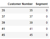
We know that the customers with higher annual incomes and higher spending scores have a cluster ID or segment id of 3 so we can filter these records and print the filtered dataset header using the following script.
segmented_data = segmented_data[segmented_data.Segment==3]
segmented_data.head()
Output:
Our
Speaking of marketing campaigns, if you want to get better at programming, we have lots of cheat sheets to help you out. Otherwise, join our email list below for weekly python tutorials with fully functioning code sent straight to your inbox.
For convenience, here’s the full code for our real-world k-means clustering example using scikit-learn:
#import dependencies
from sklearn.datasets import make_blobs
from sklearn.cluster import KMeans
from matplotlib import pyplot as plt

import numpy as np
import pandas as pd

import seaborn as sns
sns.set_style("darkgrid")

#load dataset
X = pd.read_csv('https://raw.githubusercontent.com/krishnaik06/DBSCAN-Algorithm/master/Mall_Customers.csv')
X.head()

#filter the columns
X = X.filter(["Annual Income (k$)", "Spending Score (1-100)" ], axis = 1)

#plot the raw data
sns.scatterplot(data = X, x="Annual Income (k$)", y= "Spending Score (1-100)", c = ["green"])
plt.show()

#apply scikit-learn kmeans clustering
model = KMeans(n_clusters= 5)
model.fit(X)

#print the centroids
print(model.cluster_centers_)

#plot the clustered data with centroids overlaid
sns.scatterplot(data = X, x="Annual Income (k$)", y= "Spending Score (1-100)", c= model.labels_, cmap= 'rainbow' )
sns.scatterplot(x=model.cluster_centers_[:, 0], y=model.cluster_centers_[:, 1], c=['black'])

#create dataframe with clustered labels
segmented_data = pd.DataFrame()
segmented_data['Customer Number'] = X.index.values
segmented_data['Segment'] = model.labels_

#Save segment 3 as a dataframe and display head
segmented_data = segmented_data[segmented_data.Segment==3]
segmented_data.head()