A scatter plot is used to plot a relationship between multiple lists or column values in the form of scattered data points. Python’s Seaborn library can be used to make scatter plots in two dimensions. Each data point in a Seaborn scatter plot corresponds to the interaction of values between the values on the x and y axes, respectively.
One of our earlier tutorials explained how to draw different types of plots with the Python Seaborn library. In that tutorial, we showed how to plot a very basic scatter plot using the Seaborn library. In this tutorial, we’re going to take this a step further with an in-depth review of Seaborn scatter plots.
Seaborn Installation
To install the Seaborn library, you can use pip installer. The following command installs the Seaborn library:
$ pip install seaborn
The Dataset
The dataset we’ll be using to demonstrate how to plot scatter plots with Seaborn is the tips dataset. This dataset contains information about the bills paid by different customers at a fictional restaurant during lunch and dinner. The dataset contains 244 records.
The following script imports the seaborn library and then loads the tips dataset into your application.
import seaborn as sns
import matplotlib.pyplot as plt
%matplotlib inline
sns.set_style("darkgrid")

import matplotlib.pyplot as plt
import seaborn as sns
plt.rcParams["figure.figsize"] = [8,6]
tips_dataset = sns.load_dataset('tips')
Notice we’re also importing matplotlib, which gives us more control over our scatter plots. You’ll need to make sure you have matplotlib installed, too. The %matplotlib inline code will give you an error if you’re not using the Jupyter Notebook. Just comment it out and add the line plt.show() right after the point where we start making plots.
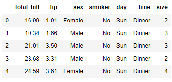
Let’s plot the first five rows of the dataset.
tips_dataset.head()Output:
The output shows that the dataset contains 7 columns.
Seaborn Scatter Plots
In this section, we’ll show how to plot different types of scatter plots using Seaborn.
Note: All the codes in this article are compiled with the Jupyter Notebook.
Basic Scatter Plot
To draw a scatter plot with the Seaborn library, the scatterplot() function of the seaborn module is used. You need to pass values for the following three parameters of the scatterplot() function.
x: The name of the list or column values to be displayed on x-axis.y: The name of the list or column values to be displayed on y-axis.data: The name of the dataset. It can be a Pandas dataframe name.
Let’s now use the scatterplot() function to plot the values from the total_bill column of the tips dataset against the values from the tips column.
sns.scatterplot(x="total_bill", y="tip", data=tips_dataset)Output:
The output shows that with the increase in total bill amount, the tip also increases.
Changing Marker Color on a Scatter Plot
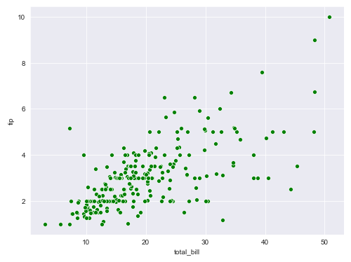
You can change the color of a scatter plot by first passing the letter of the color name to the color parameter of the scatterplot() function. The following script plots a green scatter plot for the total bill and tips column.
sns.scatterplot(x="total_bill", y="tip", data=tips_dataset, color = 'g')Output:
Behind the scenes, Seaborn scatter plots use the Matplotlib color styles. Here are the color codes for the basic colors you can use for your scatter plot markers. Pass the value in the argument column to the color parameter to change your marker colors.
| Color Argument | Color Description |
|---|---|
| b | blue |
| g | green |
| r | red |
| c | cyan |
| m | magenta |
| y | yellow |
| k | black |
| w | white |
Changing Marker Style on a Scatter Plot
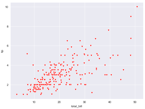
You can also change the marker style for a Seaborn scatter plot. To do so, you need to pass a marker style value to the marker attribute of the scatterplot() function as shown below:
sns.scatterplot(x="total_bill", y="tip", data=tips_dataset, color = 'r', marker = 'v')Output:
Notice how the
Just like with colors, Seaborn plots use Matplotlib markers behind the scenes. Most of the marker arguments are pretty intuitive. Here are some of the most commonly used markers for seaborn scatter plots and how to call them (left column):
| Marker Argument | Marker Description |
|---|---|
| . | point (medium circle) |
| , | pixel (small circle) |
| o | circle (large circle) |
| v | triangle pointed down |
| ^ | triangle pointed up |
| < | triangle pointed left |
| > | triangle pointed right |
| 8 | octagon |
| s | square |
| p | pentagon |
| P | plus (filled) |
| * | star |
| h | hexagon with point up |
| H | hexagon with flat side up |
| + | plus |
| x | thin x cross |
| X | thick x (filled) |
| D | diamond |
| d | thin diamond |
| | | vertical line |
| _ | horizontal line |
A complete list of markers supported by Matplotlib along with the symbols can be found at official Matplotlib documentation for Markers.
Changing Context of a Scatter Plot
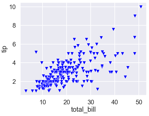
By default, the Jupyter notebook creates scatter plot to be displayed in a notebook. You can change the context of a scatter plot for other mediums as well. For instance, if you want to print your scatter plot on a poster, you can set the context of the scatter plot to poster. To do so, you have to use the set_context() method of the seaborn module. The following script prints a scatter plot with the context set as a poster.
sns.set_context('poster')
sns.scatterplot(x="total_bill", y="tip", data=tips_dataset, color = 'b', marker = 'v')
Output:
The output shows the label, titles and the plot markers are much bigger so they can be appropriately displayed on a poster.
Scatter Plot with Varying Markers Sizes
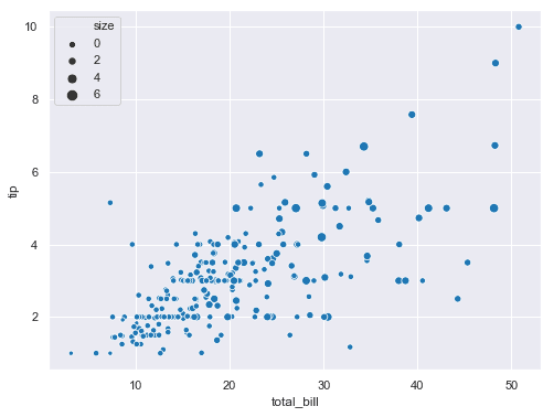
Did you know you can plot a scatter plot with multiple marker sizes? Simply pass the column you want your marker size to vary on to the size attribute. For instance, the following script plots a scatter plot where marker size varies according to the values in the size column of the tips dataset (the number of people per meal).
sns.scatterplot(x="total_bill", y="tip", size ='size', data=tips_dataset)The output shows scatter plot with different marker sizes. Notice a legend is drawn which actually displays the size and its numeric value. Here size refers to the number of people per meal.
Output:
Plotting Multiple Scatter Plots
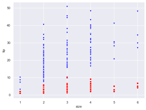
You can also plot multiple scatter plots. All you have to do is call the scatterplot() method multiple times with different column values for the y-axis. The following script plots two scatter plots:
- The first scatter displays the relationship between the values in the
sizeandtotal_billcolumns of the tips dataset. This scatter plot is displayed in blue. - The second scatter plot, displayed in red, shows the relationship between the values in the
sizeandtipcolumns.
sns.set_context('notebook')
sns.scatterplot(x="size", y="total_bill", data=tips_dataset, color = 'b', marker = 'v')
sns.scatterplot(x="size", y="tip", data=tips_dataset, color = 'r', marker = 'o')
Output:
Using hue Attribute to Group Multiple Categories
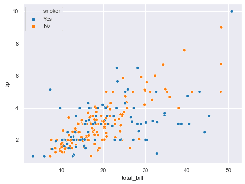
The hue attribute is used to make scatter plots divided into sub-categories. For instance, if you want to plot the relationship between total bill and tips, which is further divided into customers that are smokers and non-smokers, you can use the hue attribute, like this:
sns.scatterplot(x="total_bill", y="tip", data=tips_dataset, hue = 'smoker' , marker = 'o')Output:
In the output, the blue markers belong to smokers and the orange markers belong to non-smokers customers. This helps you identify trends between sub-groups in your Seaborn scatter plots.
Adding More Categorical Information via the style Attribute
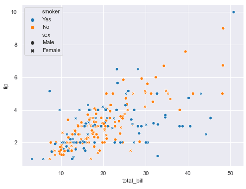
In addition to hue, you can perform further categorization via the style attribute. With the style attribute, different marker styles are displayed for different categories in a column. For instance, the following script categorizes the records into smokers and non-smokers using the hue attribute and then using the style attribute, the records are further categorized by gender.
sns.scatterplot(x="total_bill", y="tip", data=tips_dataset, hue = 'smoker', style = 'sex' , marker = 'o')Output:
This is extremely useful. The output shows the circle markers are for male customers while crosses represent records of the bills paid by female customers. Similarly, the blue color corresponds to smokers while orange corresponds to non-smokers. So, if there is a blue circle, it will mean that the bill is paid by a male customer who is a smoker.
As long as you keep the number of sub-categories reasonably small, it can be very helpful plotting multiple relationships on a single scatter plot.
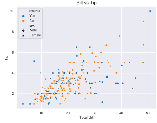
Adding Labels and Titles
Finally, you can add labels and titles to a scatter plot with Seaborn. This is where the matplotlib library helps us out.
To change the default x-label, you need to pass a new label name to the xlabel() function of the plt module. Similarly, to change y-label, you need to pass a string value to the ylabel() function. Finally, the title of a scatter plot can be updated by passing a string value to the title() function, as shown below.
sns.scatterplot(x="total_bill", y="tip", data=tips_dataset, hue = 'smoker', style = 'sex' , marker = 'o')
plt.xlabel("Total Bill", fontsize= 12)
plt.ylabel("Tip", fontsize= 12)
plt.title("Bill vs Tip", fontsize= 15)
Output:
Notice howe we used the matplotlib label contros to set our font size, as well. That’s one of the nice things about using the matplotlib to control your Seaborn plots.
I hope you enjoyed this Seaborn scatter plot tutorial. For more ways to use visualize your data with Python, subscribe using the form below. We’ll send you some helpful tutorials every once in a while to make sure you’re getting the most out of Python.
