A bar plot, also known as a bar graph, is a type of graph used to plot categorical data in the form of rectangular bars where heights of bars are proportional to the numeric value represented by the corresponding categorical columns. The categories in a bar plot are plotted on the x-axis and their corresponding numeric values are represented by heights of the bars on the y-axis.
In one of my earlier articles, I explained how to draw different types of plots with the Python Seaborn library. In that article, we saw how to plot a very basic bar plot with the Seaborn library. In this article, we will have a more in-depth review of Seaborn bar plots. Because of their syntax, bar plots in Seaborn are often referred to as Seaborn barplots.
Seaborn Installation
To install the Seaborn library, you can use pip installer. The following command installs the seaborn library:
$ pip install seaborn
The dataset
The dataset we will be using to demonstrate bar plots with Seaborn is the seaborn library and then loads the
import seaborn as sns
import matplotlib.pyplot as plt
%matplotlib inline
sns.set_style("darkgrid")
titanic_dataset = sns.load_dataset("titanic")
The %matplotlib inline code will give you an error if you’re not using the Jupyter Notebook. Just comment it out and add the line plt.show() right after the point where we start making plots.
Let’s plot the first five rows of the dataset.
titanic_dataset.head()Output:

Seaborn Bar Plots
In this section, we’ll show you how to plot and customize your Seaborn barplots.
Note: All the codes in this article are compiled with the Jupyter Notebook.
Before we draw any plot, let’s increase the default plot size for the Jupyter Notebook:
fig_size = plt.rcParams["figure.figsize"]
fig_size[0] = 8
fig_size[1] = 6
plt.rcParams["figure.figsize"] = fig_size
Basic Bar Plot
To draw a bar plot with the Seaborn library, the barplot() function of the seaborn module is used. You need to pass values for the following three parameters of the barplot() function.
x: Which contains the name of the categorical column.y: Which contains the name of the numerical column.data: Which stores the name of the dataset.
Let’s now use the barplot() function to plot the gender of the passengers in the titanic ship along with the survival rate.
sns.barplot(x='sex', y='survived', data=titanic_dataset)Output:
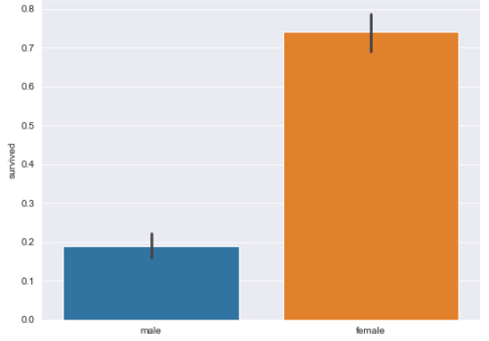
The output shows that among female passengers, the average survival rate was more than 0.70, while for males the average survival rate was less than 0.20. It is important to mention that by default, the bar plot plots the average of the numeric columns grouped by categories.
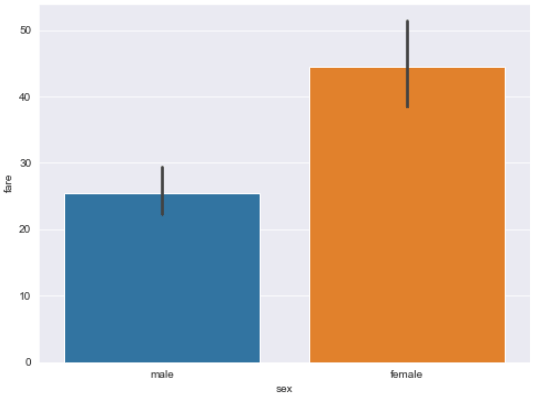
In the same way, you can plot the gender of the passenger along with the average fare for the two genders, as shown below:
sns.barplot(x='sex', y='fare', data=titanic_dataset)Output:
Annotating Bar Plots
There is no direct way to annotate the bar plots drawn by seaborn. If you want to display the actual values represented by bars in a seaborn bar plot, you have to do work around.
Firstly, you have to group all the values in your dataset by the column that you want to use for the x-axis of your bar plot. For instance, if you want to plot a bar plot that shows gender vs survival rates, you will group the data by sex column as shown below:
groupedvalues = titanic_dataset.groupby('sex').sum().reset_index()
groupedvalues.head()
Output:

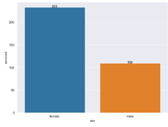
You can see that the values in all the columns have now been grouped by gender. The next step is to plot the bar plot by calling the barplot() function. The returned object can be stored in a variable. Next, to annotate the bars, you can simply iterate through all the rows in the grouped dataframe and call the text() method on the object. The first parameter of the text() method should be the name of the row, and the second and third parameters should be the name of the numeric columns which represents the bar plot’s height e.g. survived. You’re basically looping through all the values and adding a text label to each categorical column.
g =sns.barplot(x='sex',y='survived',data=groupedvalues)

for index, row in groupedvalues.iterrows():
    g.text(row.name,row.survived, round(row.survived,2), color='black', ha="center")
Output:
Using hue Attribute to Group Multiple Categories
The hue attribute can be use to plot bar plots further grouped into sub-categories. For instance, if you want Seaborn to plot the survival rate with respect to genders, which is further divided into classes, you can use hue attribute as follows:
sns.barplot(x='sex', y='survived', hue = 'class', data=titanic_dataset)Output:
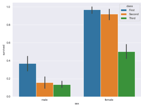
The bar plot now displays class information in addition to gender of the passenger. The output clearly shows that survival rate is highest for the females with first class tickets, followed by second and third class. This trend is also visible among male passengers.
Changing the Order of Categories
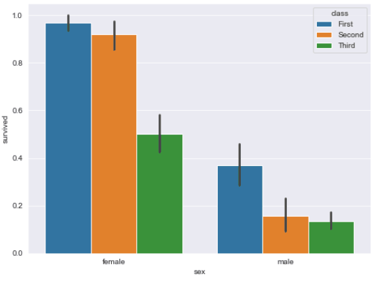
You can also change the default order in which the categories are displayed on the bar plot. For instance, in the previous plots, information for the male passengers is displayed on the left, and for the female passengers the information is displayed on the right. You can change the order via the order parameter. The list of categories is passed in the order in which you want to display them. For instance, the following script displays the information for the female passengers on the left, and the information for the male passengers on the right.
sns.barplot(x='sex', y='survived', hue = 'class', order = ['female', 'male'], data=titanic_dataset)Output:
Displaying Sum Instead of Mean
By default the bar plot displays mean values. You can also display the sum of the numeric values per categories. To do so, you have to pass estimator parameter. For instance, the following script displays, for both genders, the sum of surviving passengers.
sns.barplot(x='sex', y='survived', hue = 'class', order = ['female', 'male'], estimator = sum, data=titanic_dataset)Output:
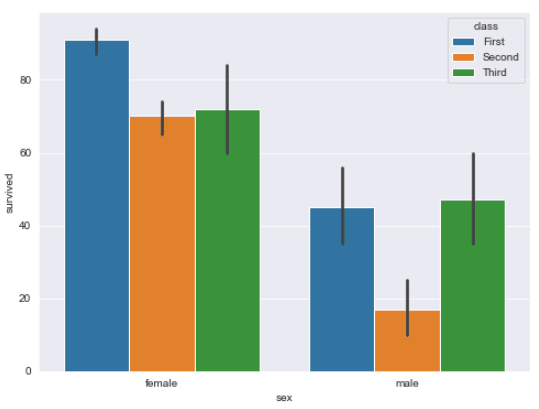
The output shows that more than 80 female passengers with first class tickets survived. The lowest number of surviving passengers were males with second class tickets.
Changing Plot Color
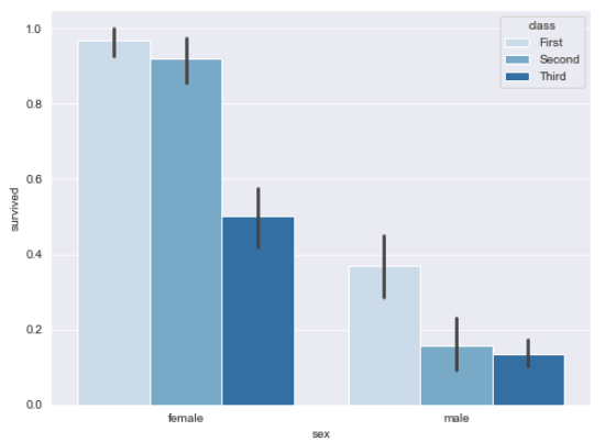
The default plot color for the Seaborn bar plots can be changed by specifying a value for the palette attribute. The list of the possible values for the palette attribute is available at this link. The following script makes a Seaborn barplot with different shades of blue.
from numpy import median
sns.barplot(x='sex', y='survived', hue = 'class', order = ['female', 'male'], palette="Blues_d", data=titanic_dataset)
Output:
Adding Labels
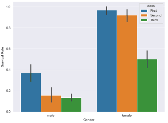
You can also update the default Seaborn bar plot labels. To do so, you need to chain the set() function with the barplot() function. The value for the label on the x-axis is passed to the set() function, and the value for the y-axis label is passed to the
sns.barplot(x = 'sex', y = 'survived', hue = 'class', data = titanic_dataset).set(xlabel='Gender', ylabel='Survival Rate')Output:
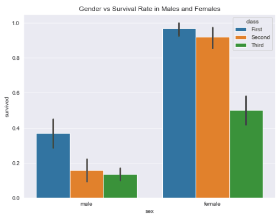
Similarly, to set the title, you can chain the set_title function with the seaborn’s barplot() function and pass it the string that you want to use for the Searborn barplot title as shown in the example below:
sns.barplot(x = 'sex', y = 'survived', hue = 'class', data = titanic_dataset).set_title("Gender vs Survival Rate in Males and Females")Output:
Multiple Bar Plots
You can also plot multiple bar plots that correspond to unique values in a particular categorical column. For instance, if you want to plot the gender against survival rate for the passengers travelling alone, and for those not travelling alone, you can plot multiple bar plots. To do so, you need to call the catplot() function. The name of the category for which you want to plot multiple bar plots is passed to the
sns.catplot(x="sex", y="survived", hue="class", col="alone", data=titanic_dataset, kind="bar");Output:
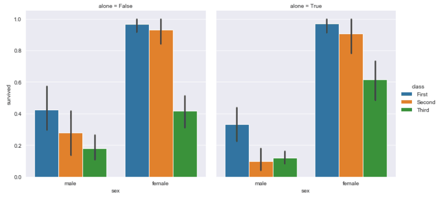
You can see that two bar plots have been plotted. The bar plot on the left shows the gender vs survival rate for the passengers not travelling alone, whereas the bar plot on the right depicts the same information for the passengers travelling alone.
Conclusion
A bar plot is great for plotting numerical information grouped by categories. In this tutorial you saw how to use the Python Seaborn library to plot different type of Seaborn barplots. We answer some common questions, including how to add titles to your Seaborn bar plots, how to display your bar plots with values, and how to group bar plots. If you enjoyed this tutorial, I hope you’ll subscribe using the form below. We’ll let you know when we have similar tutorials for you to try.
