Line plots are commonly used to plot relationships between two numeric lists of values. A line plot, as the name suggests, draws a line that shows positive or negative trends for the data on the y-axis, with respect to an increase or decrease in values on the x-axis. For instance, a line plot can be used to plot monthly or yearly stock prices and the temperature changes over a certain period. In this article, you will see how to draw line plots with the Python Seaborn library.
Note: All the codes in this article are compiled with the Jupyter Notebook.
Seaborn Installation
To install the Seaborn library, you can use pip installer. The following command installs the seaborn library:
$ pip install seaborn
Import Required Libraries
Before we can actually use the Seaborn library, we need to import it along with the Matplotlib and Pandas Libraries:
import seaborn as sns
import matplotlib.pyplot as plt
import pandas as pd
%matplotlib inline
sns.set_style("darkgrid")
The %matplotlib inline code will only work with the Jupyter Notebook. If you’re not using the Jupyter Notebook, just comment it out and add the line plt.show() right after the point where we start making plots.
Let’s change the default plot size so we have a better view of our line plots:
fig_size = plt.rcParams["figure.figsize"]
fig_size[0] = 10
fig_size[1] = 6
plt.rcParams["figure.figsize"] = fig_size
Basic Example of a Line Plot
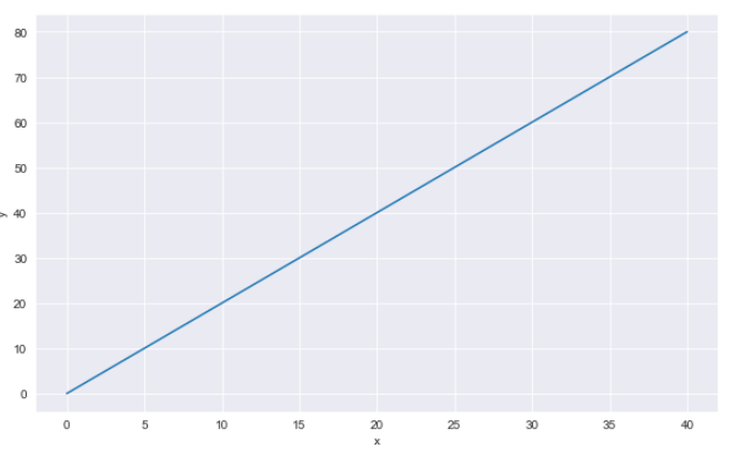
Before we go ahead and see line plots drawn using a real dataset in Seaborn, let’s draw a line plot using dummy data for the sake of understanding. To draw a line plot in the Seaborn library, the lineplot() function is used. The x attribute of the lineplot() function contains the list of the values to be displayed on the x-axis. For the y-axis, the list of values is passed to the y attribute. In the data attribute, you have to pass the name of the pandas dataframe that contains columns for the values passed in the x and y attributes. Let’s create a dummy pandas dataframe with columns x and y.
x = list(range(0,41,2))
print(x)
y = [i * 2 for i in x]
print(y)
my_data = pd.DataFrame({'x':x, 'y':y})
In the script above, we created two lists x and y. The values in list y are twice the corresponding values in list x. Next, we create a simple dataframe which contains the two lists as columns.
Let’s now see how we can draw a Seaborn line plot using the my_data dataframe:
sns.lineplot(x='x',y='y', data=my_data)Output:
Line Plot with Real World Dataset
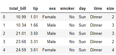
Let’s now see how we can draw line plots with the Seaborn library using a real world dataset. We will use the tips dataset to draw line plots. The tips dataset contains records of bills paid by different customers at a restaurant. The dataset comes built-in with the Seaborn library. The following script imports the tips dataset and displays the header of the dataset.
dataset = sns.load_dataset("tips")
dataset.head()
Output:
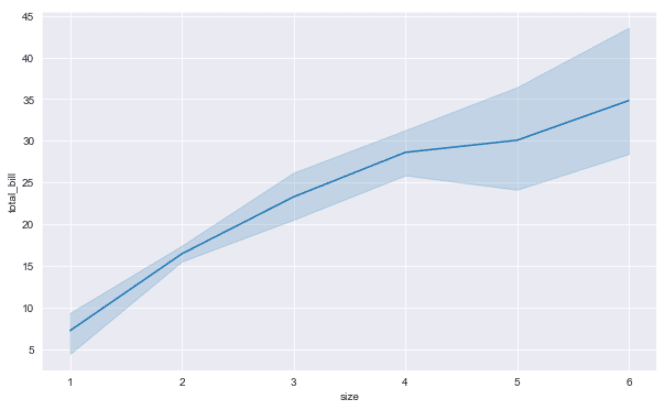
You can see that the dataset contains six columns. Let’s now plot a line plot that shows a relationship between the size(number of people) of the group, and the total bill paid.
sns.lineplot(x='size',y='total_bill', data=dataset)Output:
The output shows that with the increase in number of people, the total bill increases, which makes sense.
Removing the Confidence Interval
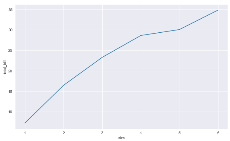
The semi-transparent region that you see around the line in a seaborn line plot shows the confidence interval. By default, seaborn line plots show confidence intervals for the dataset. You can remove the confidence interval by setting the ci parameter of the lineplot() function to None as shown below.
sns.lineplot(x='size',y='total_bill', data=dataset, ci= None)Output:
Setting the Style for the Confidence Interval
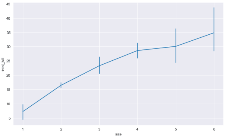
By default, the Seaborn line plot confidence interval is represented by a translucent area around a line. You can change the representation style by passing bars as a value for the err_style argument. Look at the following script:
sns.lineplot(x='size',y='total_bill', data=dataset, err_style ="bars")In the output, you will see the confidence interval represented in the form of vertical bars as shown in the output below.
Output:
Line Plots for each Category Value
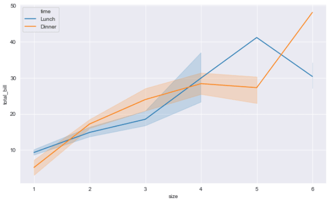
You can also plot multiple line plots, one each for every unique value in your categorical column. You have to specify the column value for the hue parameter. For instance, the following script displays two line plots. One line plot shows the relation between number of people and total bill for lunch, while the other line plot displays the same information for the dinner.
sns.lineplot(x='size',y='total_bill', hue = 'time', data=dataset)Output:
In the output, you can now see two line plots. Also, you can see that the legend containing information about the plots has appeared at the top-left of the plot.
Changing Line plot Style
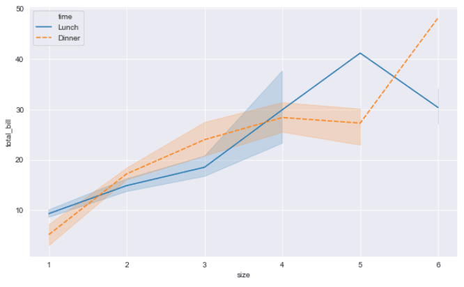
To further differentiate between multiple line plots, you can use the use the style attribute and set its value to the name of the column value that is passed in the hue attribute.
sns.lineplot(x='size',y='total_bill', hue = 'time', data=dataset, style ='time')Output:
The resulting image shows that the line plot for dinner is now dashed.
Changing Line plot Colors
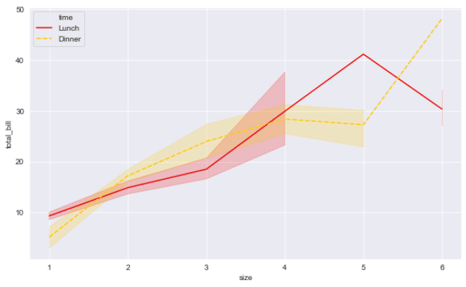
In addition to changing styles, the color of Seaborn line plots can also be changed. To do so, you have to specify the value for the palette attribute. A complete list of Seaborn color palettes is available at this link.
Let’s change the palette value to hot and see what happens.
sns.lineplot(x='size',y='total_bill', hue = 'time', data=dataset, style ='time', palette = 'hot')Output:
Removing Dashes from Line Plots
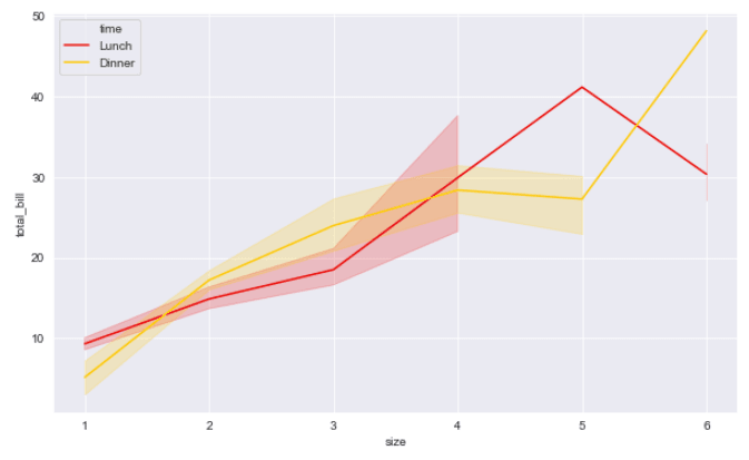
If you want to remove dashes from a Seaborn line plot, simply set the dashes attribute of the lineplot() function to false.
sns.lineplot(x='size',y='total_bill', hue = 'time', data=dataset, style ='time', palette = 'hot', dashes = False)Output:
Line Plot Markers
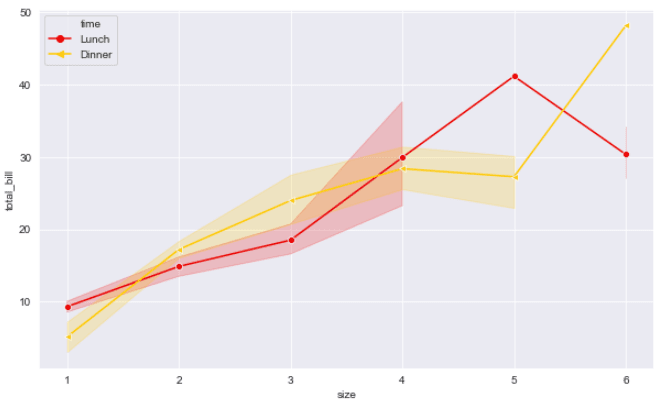
You can also plot markers on a Seaborn line plot. Markers are special symbols that appear at the places in a line plot where the values for x and y axes intersect. To plot markers, you have to pass a list of symbols in a list to the markers attribute. Each symbol corresponds to one line plot. Let’s plot Seaborn line plots with circles and triangles as markers.
sns.lineplot(x='size',y='total_bill',  hue = 'time', data=dataset, style ='time',
             palette = 'hot', dashes= False, markers= ["o","<"])
Output:
Setting Axis Labels and Titles
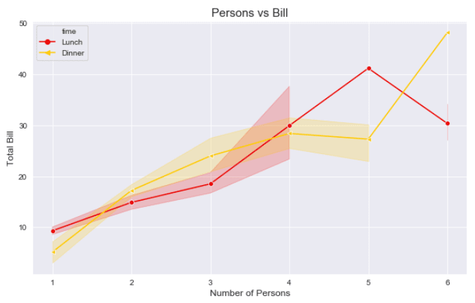
Finally, you can also change the default axis labels for a Seaborn line plot. To change the x-label, you have to pass a value string to the xlabel() method of the plt object. Similarly, to update the label for the y-axis, simply pass a string value to the ylabel() method. Finally, to set the title, you need to pass a value for the title() function as shown below:
sns.lineplot(x='size',y='total_bill',  hue = 'time', data=dataset, style ='time',
             palette = 'hot', dashes= False, markers= ["o","<"])
plt.xlabel("Number of Persons", fontsize= 12)
plt.ylabel("Total Bill", fontsize= 12)
plt.title("Persons vs Bill", fontsize= 15)
Output:
Conclusion
Line plots are used to plot a relation between two lists of numeric values. In this article you saw how to use Python Seaborn library to plot and modify line plots with the help of various examples. If you enjoyed this tutorial, I hope you’ll subscribe using the form below. We’ll let you know when we have similar tutorials for you to try.
