A histogram is a type of graph used to plot data distributions. In one of our earlier tutorials, we explained how to draw different types of plots with the Python Seaborn library. In that tutorial, we learned how to plot a very basic histogram using the Seaborn library. This tutorial will take a more in-depth look at how to plot different types of histograms using the Python seaborn library.
Specifically, we’ll be plotting data from a Pandas Dataframe using Seaborn’s sns.distplot. This isn’t the first time we’ve talked about plotting histograms with Python. A couple months ago, we had a full tutorial about plotting histograms with Pandas built-in DataFrame.Hist method. The Seaborn histogram plotting features are a bit more flexible so we’ll go into more detail about them here.
It’s worth mentioning that distplot is now a deprecated function and will be removed in a future version of Seaborn. You’ll need to update your code to use displot or histplot once it’s fully removed from Seaborn. We have a full tutorial on the different seaborn plot types.
Seaborn Installation
Before you can start creating histograms with Seaborn, you need to install the Seaborn library. The following command installs the seaborn library using the pip installer:
$ pip install seaborn
The dataset
The dataset we’ll be using to demonstrate bar plots with Seaborn is the
The following script imports the seaborn library and loads the
import seaborn as sns
import matplotlib.pyplot as plt
%matplotlib inline
sns.set_style("darkgrid")

plt.rcParams["figure.figsize"] = [8,6]
titanic_dataset = sns.load_dataset('titanic')
The %matplotlib inline code will give you an error if you’re not using the Jupyter Notebook. Just comment it out and add the line plt.show() right after the point where we start making plots.
Let’s plot the first five rows of the dataset.
titanic_dataset.head()Output:
Seaborn histograms
Now we’re going to show you how to plot different types of histograms with the Python seaborn library.
Basic Seaborn Histogram
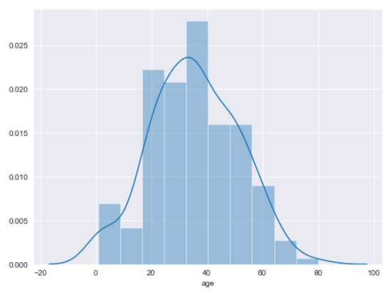
To plot a simple histogram, use the distplot() function of the seaborn library. You need to pass the column of the pandas dataframe for which you want to display the data distribution. For instance, the following script plots a histogram for the age column of the Titanic dataset.
titanic_dataset.dropna(inplace = True)
sns.distplot(titanic_dataset["age"])
Output:
The output shows a histogram with a kernel density estimation (KDE) line.
Removing KDE Line
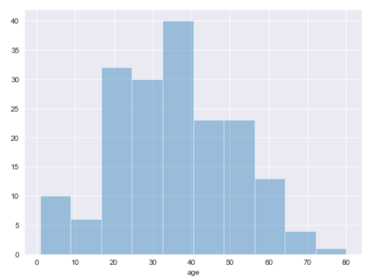
You can remove the default KDE line from a histogram by passing kde attribute of the distplot() function, like this:
sns.distplot(titanic_dataset["age"], kde = False)Output:
See how the KDE line has been removed from the above output?
Displaying KDE Line Only
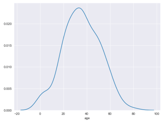
On the contrary, if you want to remove the histogram bars and display only the KDE line, you need to pass hist attribute. Look at the following example:
sns.distplot(titanic_dataset["age"], hist = False)Output:
Changing Number of Bins
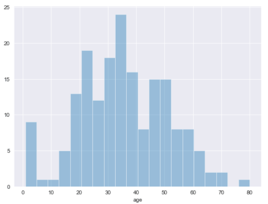
By default, the seaborn histogram distributes data into 10 bins. You can increase or decrease the number of bins by passing an integer value to the bins attribute of the distplot() function. For instance, the following script plots a histogram with 20 bins.
sns.distplot(titanic_dataset["age"], kde = False, bins = 20)Output:
Plotting Multiple Histograms
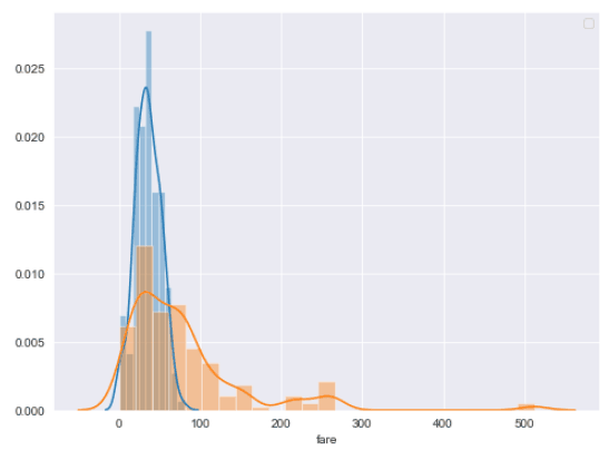
Plotting multiple histograms in one plot is a straight-forward process with seaborn, too. All you have to do is call the distplot() function twice with different dataframe columns. For instance, the following script plots two histograms: one for the age column and the other for the fare column.
sns.distplot(titanic_dataset["age"])
sns.distplot(titanic_dataset["fare"])
plt.legend()
Output:
You can see the x-axis defaults to the label of the second histogram added. We’ll talk more about editing labels in a few sections. Also notice how the y-axis changes from a numeric quantity to a probability distribution.
Changing Histogram Orientations
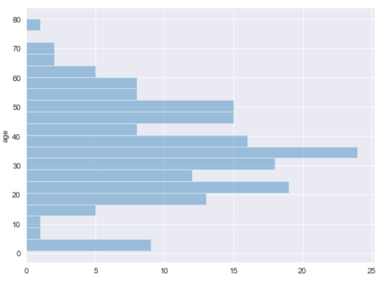
You can change the default orientation of seaborn histograms by passing vertical attribute. In the output, you’ll see a vertical histogram instead of the default horizontal one.
sns.distplot(titanic_dataset["age"], vertical= True, kde = False, bins = 20)Output:
Changing Histogram Colors
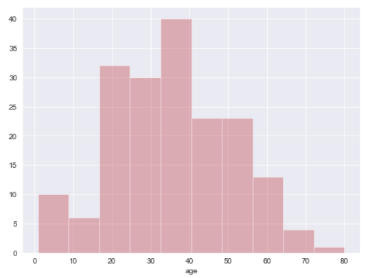
To change the color of your seaborn histograms, first you have to call the set_color_codes() method of the seaborn module. Next, the shorthand notation for the color is passed to the color attribute of the distplot() function. The following script plots a red histogram since we pass
sns.set_color_codes()
sns.distplot(titanic_dataset["age"], kde = False, color = "r")
Output:
Adding Labels and Titles to a Histogram
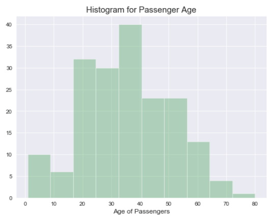
To add labels and titles to a histogram, you can use the plt.xlabel, plt.ylabel, and plt.title attributes as shown in the following script.
sns.set_color_codes()
sns.distplot(titanic_dataset["age"], kde = False, color = "g")

plt.xlabel("Age of Passengers", fontsize= 12)
plt.title("Histogram for Passenger Age", fontsize= 15)
Output:
I hope you enjoyed our Seaborn histogram tutorial. For more ways to use visualize your data with Python, subscribe using the form below. We don’t email often, but we’ll send you our most helpful tutorials to make sure you’re getting the most out of Python.

