In this tutorial, we will learn how to work with time series data using Pandas, including resampling, shifting, and rolling data. We will be using a sample Pandas DataFrame for demonstration purposes. To follow this tutorial, you should be familiar with the basics of Pandas and Matplotlib, since we’ll end this tutorial with some time series data visualization.
Sample DataFrame
First, let’s create a sample Pandas DataFrame with time series data. We’re going to make a time series with hourly data here:
import pandas as pd
import numpy as np

date_rng = pd.date_range(start='1/1/2023', end='1/10/2023', freq='H')
df = pd.DataFrame(date_rng, columns=['date'])
df['data'] = np.random.randint(0,100,size=(len(date_rng)))
df.head()
Now we have a DataFrame df with a DatetimeIndex and a column data containing random integers. We’re going to use this DataFrame as the basis for our time series analysis.
	date	data
0	2023-01-01 00:00:00	61
1	2023-01-01 01:00:00	75
2	2023-01-01 02:00:00	27
3	2023-01-01 03:00:00	61
4	2023-01-01 04:00:00	58
Resampling
Resampling is a technique used to change the frequency of the time series data. You can either upsample (increase the frequency) or downsample (decrease the frequency). There are sophisticated ways to perform upsampling and downsampling, but we’re going to use a built-in Pandas method in this tutorial.
For example, if we want to resample our data to daily frequency, we can use the resample() method with ‘D’ specified for a daily resampling:
daily = df.resample('D', on='date').mean()
daily.head()
This will resample our data to daily frequency and compute the mean of the data for each day.
	data
date
2023-01-01	47.666667
2023-01-02	58.291667
2023-01-03	47.833333
2023-01-04	46.750000
2023-01-05	50.041667
The option ‘D’ is just one frequency option available in the resample() method. There are several other options available, as well. Some of the most commonly used options include:
- ‘T’ or ‘min’: Minute
- ‘H’: Hour
- ‘D’: Day
- ‘W’: Week
- ‘M’: Month end
- ‘MS’: Month start
- ‘Q’: Quarter end
- ‘QS’: Quarter start
- ‘A’ or ‘Y’: Year end
- ‘AS’ or ‘YS’: Year start
Shifting
Shifting is used to move the data points forward or backward in time. This can be useful for calculating differences or changes in the data over time.
For example, let’s shift the data by one position, which corresponds to one hour in our dataset, and then subtract the two columns to show the change in values from one hour to the next.
df['shifted'] = df['data'].shift(1)
df['hourly_difference'] = df['shifted'] - df['data']
df.head()
Now we have a new column shifted in our DataFrame which contains the data shifted by one hour and a new column with the change in hourly values.
	date	data	shifted	hourly_difference
0	2023-01-01 00:00:00	61	NaN	NaN
1	2023-01-01 01:00:00	75	61.0	-14.0
2	2023-01-01 02:00:00	27	75.0	48.0
3	2023-01-01 03:00:00	61	27.0	-34.0
4	2023-01-01 04:00:00	58	61.0	3.0
Rolling
Rolling is used to create a rolling view of the data, which can be useful for smoothing the data or calculating rolling statistics, such as a rolling mean or rolling standard deviation.
For example, let’s calculate the rolling mean with a window size of 6. With our data, this will generate a rolling 6 hour average:
df['rolling_mean'] = df['data'].rolling(window=6).mean()
print(df.iloc[3:9])
Now we have a new column rolling_mean in our DataFrame which contains the rolling mean of the data with a window size of 6.
                 date  data  shifted  hourly_difference  rolling_mean
3 2023-01-01 03:00:00    61     27.0              -34.0           NaN
4 2023-01-01 04:00:00    58     61.0                3.0           NaN
5 2023-01-01 05:00:00    28     58.0               30.0           NaN
6 2023-01-01 06:00:00    41     28.0              -13.0     50.142857
7 2023-01-01 07:00:00    10     41.0               31.0     42.857143
8 2023-01-01 08:00:00    34     10.0              -24.0     37.000000
Visualization
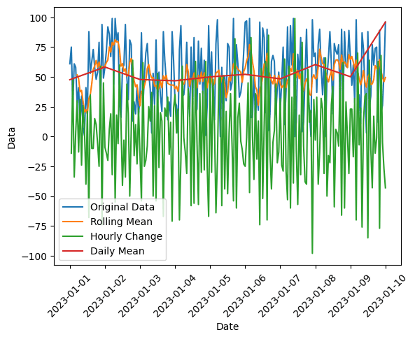
We’re done manipulating our time series data using Pandas, so let’s view our results. We can visualize the original data, daily average, rolling mean, and the hourly change we calculated by shifting our data using Matplotlib:
import matplotlib.pyplot as plt
plt.plot(df['date'], df['data'], label='Original Data')
plt.plot(df['date'], df['rolling_mean'], label='Rolling Mean')
plt.plot(df['date'], df['hourly_difference'], label='Hourly Change')
plt.plot(daily.index,daily['data'], label='Daily Mean')
plt.xlabel('Date')
plt.ylabel('Data')
plt.xticks(rotation=45)
plt.legend()
plt.show()
This will plot the data we want on the same graph, allowing us to visually compare and analyze our time series data:

Summary
In this tutorial, we learned how to work with time series data using Pandas, including resampling, shifting, and rolling data. We also demonstrated how to visualize the data using Matplotlib. By applying these techniques, you can explore and analyze your time series data more effectively. For more of tips to help you get the most out of Python, consider subscribing using the form below.
