The visual cortex of our brain is highly optimized to make sense of visual data. For that reason, people tend to like charts and visualizations, since they can communicate significant amounts of information at a glance. For anyone who wants to translate numerical information into easily-understood forms, charts are an indispensable tool.
Excel has plenty of great charting features, and VBA allows us to automatically generate these charts. This can be useful for creating visualizations from new data or updating existing visualizations that come from another source (like a coworker who doesn’t want to do all the formatting…).
This tutorial will walk you through everything you need to know to get started automatically creating and editing Excel charts using VBA. For the downstream macros to make sense, I encourage you to start from the top of this tutorial. That’s where we’ll first make our charts using VBA. However, if you’re looking for help on a specific topic, just click the link you want in our table of contents:
Creating the Chart
If you’re using VBA to make an Excel chart from scratch, you first need to add the chart to your workbook. There are actually two types of charts in Excel:
- Embedded charts
- Chart sheets
An embedded chart is a chart that appears on a parent worksheet, while a “chart sheet” is a single chart that resides on its own sheet. The chart sheet doesn’t have any cells or data on the sheet; it just sits there on its own tab. We talked about these two chart types when learning how to print all the charts in an Excel file using VBA
The code for creating the two chart types are slightly different, but once they’re created, much of the chart manipulation code is the same.
You can run one of these two blocks of code to add your own charts:
Sub create_embedded_chart()
Dim oChartObj As ChartObject

Set oChartObj = ActiveSheet.ChartObjects.Add(top:= 0, left:= 0, width:= 50, height:= 50)

End Sub
Sub create_chart_sheet()
Dim oChartSheet As Chart
Set oChartSheet = Charts.Add
End SubMake powerful macros with our free VBA Developer Kit This is actually pretty neat. If you have trouble understanding or remembering it, our free VBA Developer Kit can help. It’s loaded with VBA shortcuts to help you make your own macros like this one - we’ll send a copy, along with our Big Book of Excel VBA Macros, to your email address below.
By running these macros, you’ll end up with one of these two Excel chart layouts:
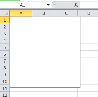
The Embedded Chart version
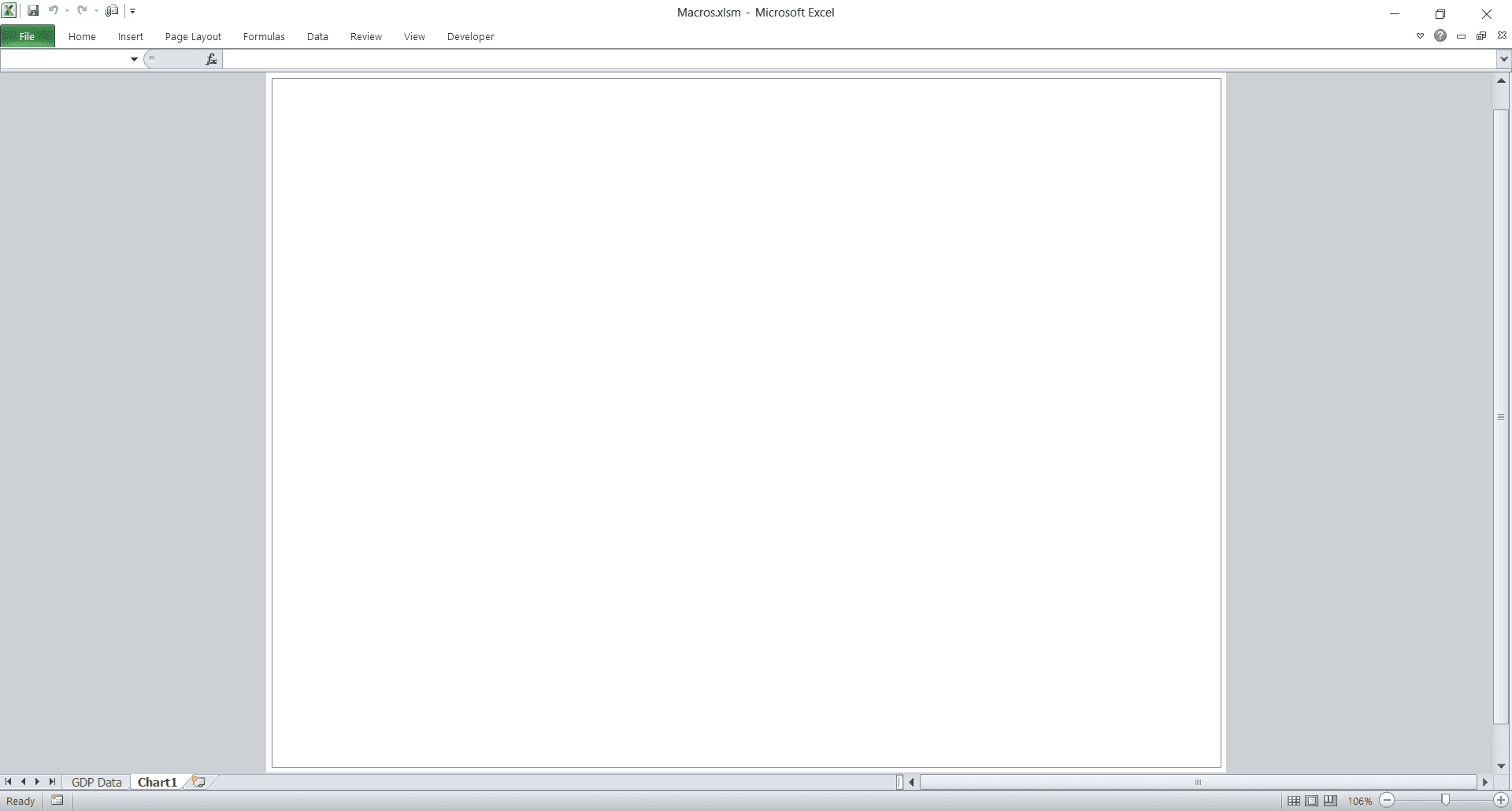
The Standalone Chart Sheet Type
(note the absence of cells on this sheet)
The ChartObject Container
In the embedded chart style we used above, we needed to declare our object as a ChartObject and use the ChartObjects collection. So what exactly is a “ChartObject”?
ChartObject is simply a container, or wrapper, for the chart. Since the chart will live on another object (the worksheet), Excel needs a way to separate the chart from the underlying worksheet. If the VBA engine didn’t do this, the two would bleed into each other and we wouldn’t know what was a chart and what was a worksheet. Can you imagine how painful the programming would be if that were the case? The plural, ChartObjects, is just the collection of all embedded charts available in the specified worksheet.
See how we used ActiveSheet.ChartObjects when adding our embedded chart? It’s very important to specify a parent worksheet (ActiveSheet, or a sheet name like “GDP Data”) where the new chart can live. If you don’t, you will get an error when trying to create an embedded chart with VBA since it won’t know where to embed the chart.
With that said, there are two points to consider when making an embedded chart using the ChartObject.Add method:
- Four arguments are required so Excel knows where and how big the embedded chart should be, and
- There needs to be a parent sheet on which the chart will live.
In our example, we defined ActiveSheet as our parent sheet, which places the chart on our current sheet. Regarding the 4 required arguments, the units of the dimensions are in points, where each point is 1/72nd of one inch. If you’re wondering, this is where font sizes, like 12-point and 10-point, come from. You’ll likely want to make your embedded chart much bigger than we did in our sample macro.
The ChartObject object contains a Chart object within it. How many times can we fit the words Chart and Object in one sentence!? It’ll make more sense going forward since that’s what we will be working with from now on.
Adding Data
Now that we have our chart, we need to add some data to it. Let’s use some GDP figures from Wikipedia as our data source.
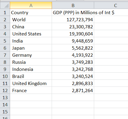
The Top 10 Countries by GDP (PPP) in 2017, according to the World Bank
If you’ve been following the wellsrPRO Training Program, you’ll recognize we’ve been interacting with Wikipedia a lot lately as part of our VBA webscraping tutorials.
To add this data to our charts, we simply use the SetSourceData method of the chart object we created earlier. In this example, we’re assuming our data is stored on a worksheet named
Embedded Chart
'Add Data to Embedded Chart
oChartObj.Chart.SetSourceData Sheets("GDP Data").Range("A3:B12")
Chart Sheet
'Add Data to Chart Sheet
oChartSheet.SetSourceData Sheets("GDP Data").Range("A3:B12")
Remember, ChartObject object to set the data. That’s why you see the .Chart. in the middle of the dot notation for the Embedded Chart. On the other hand, oChartSheet is itself a Chart object, so we don’t need to drill down to define it.
Once we’re done adding the data to our two Excel chart types, we end up with these two figures:
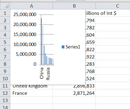
The (rather small) embedded chart
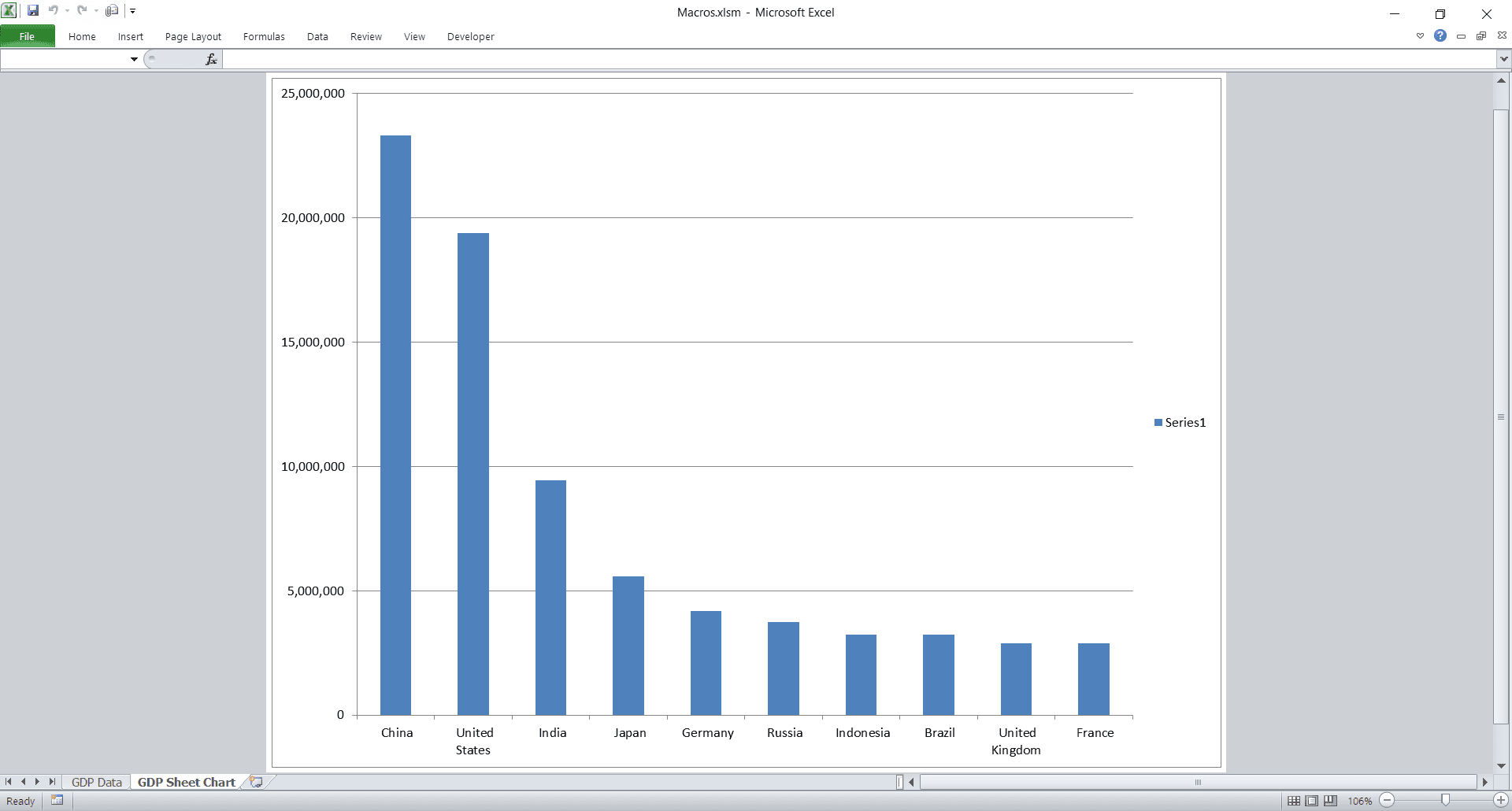
The Chart Sheet version of the GDP Data
Adding Data to Scatter Plots
Adding data to scatter plots is a bit different. Since scatter plots have a defined X-axis and Y-axis, you have to add each new series individually and then modify their corresponding X and Y values. We have a dedicated tutorial for controlling scatter plots with VBA, but we’ll show you the basics here.
Sub create_embedded_ScatterPlot()
Dim oChartObj As ChartObject

Set oChartObj = ActiveSheet.ChartObjects.Add(Top:=10, Left:=100, Width:=250, Height:=250)
With oChartObj.Chart
    .ChartType = xlXYScatter
    .SeriesCollection.NewSeries
    .SeriesCollection(1).Name = "My Data Name"
    .SeriesCollection(1).XValues = ActiveSheet.Range("B1:B10")
    .SeriesCollection(1).Values = ActiveSheet.Range("A1:A10")
End With
End Sub
The example above doesn’t use the same GDP data we assumed above. We just made up a set of data with numbers for the X-axis and the Y-axis.
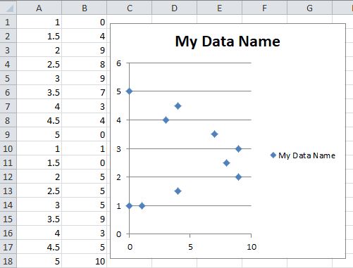
Notice how much the syntax for adding data to a scatter plot differs from adding data to a bar chart. To add data to a scatter plot using VBA, you must complete all these steps:
- Change the chart type to
xlXYScatter - Add a new series to the scatter plot using the
SeriesCollection.NewSeriesmethod - Set the X-axis data for the newly added series using the
.XValuesproperty - Set the Y-axis data for the newly added series using the
.Valuesproperty
Because we only added one series to our data, we’re able to access the data using the SeriesCollection(1) collection. If we wanted to add a second series, we would have to call the .SeriesCollection.NewSeries method twice and then change the
Accessing the Charts
Before we continue, we should learn how to properly access our charts using VBA. If you’ve been following along and have had to rerun macros, you’ve probably created a bunch of charts already. We only want one, so let’s look at accessing the charts we already created so we don’t have to keep creating new ones every time we run a subroutine.
Chart Sheet Style
Accessing a chart sheet is as simple as setting the chart to your object without the Add method:
dim oChartsht as Chart
Set oChartsht = Charts("GDP Sheet Chart")
If you look at the screenshots above, you can see I’ve changed the name of the chart sheet to
The variable
Embedded Chart Style
Since embedded charts live on worksheets, we can only find them via the parent worksheet. Unfortunately, embedded charts are not constituents of the Charts collection. That collection only holds sheet-style charts.
Dim oChart As Chart
Set oChart = Sheets("GDP Data").ChartObjects(1).Chart
Now
As long as we only have one chart on our sheet, the macro we used will grant access to the correct chart. If there are more charts, you will need to find the right number in the collection. If all your charts are unnamed, you can typically find the correct number by selecting your chart and viewing the name in the upper left of Excel.
Manipulating Charts
There are plenty of properties and methods for controlling charts in VBA. We’ll look at the ones necessary to make your charts look nice. If you’ve declared your variables, I encourage you to use Intellisense to play around with the other methods and properties.
Changing the Chart Type
Maybe you don’t like the default bar chart for GDP figures and you’d rather a pie chart. Excel certainly offers pie charts, and you can easily change your chart style in VBA. Note that oChart is how you told VBA to access your charts. If you’ve been following the snippets in this tutorial, your chart sheet name is probably
oChart.ChartType = xlPieThere are tons of different chart types in Excel. You can easily scroll through them with Intellisense, since their names accurately describe the chart types. You can use the Enumeration number associated with the chart types directly in your code if you want to irritate future coders, but I suggest using the human-recognizable names (like xlPie).
Here are a few of the most common VBA chart types:
| xlChartType Name | Corresponding Value | Description |
|---|---|---|
| xlColumnClustered | 51 | Clustered Column. |
| xlColumnStacked | 52 | Stacked Column. |
| xlColumnStacked100 | 53 | 100% Stacked Column. |
| xlBarClustered | 57 | Clustered Bar. |
| xlBarStacked | 58 | Stacked Bar. |
| xlBarStacked100 | 59 | 100% Stacked Bar. |
| xlLine | 4 | Line. |
| xlLineStacked | 63 | Stacked Line. |
| xlLineStacked100 | 64 | 100% Stacked Line. |
| xlLineMarkers | 65 | Line with Markers. |
| xlLineMarkersStacked | 66 | Stacked Line with Markers. |
| xlLineMarkersStacked100 | 67 | 100% Stacked Line with Markers. |
| xlPie | 5 | Pie. |
| xlPieOfPie | 68 | Pie of Pie. |
| xlPieExploded | 69 | Exploded Pie. |
| xlXYScatter | -4169 | Scatter. |
| xlXYScatterSmooth | 72 | Scatter with Smoothed Lines. |
| xlXYScatterSmoothNoMarkers | 73 | Scatter with Smoothed Lines and No Data Markers. |
| xlXYScatterLines | 74 | Scatter with Lines. |
| xlXYScatterLinesNoMarkers | 75 | Scatter with Lines and No Data Markers. |
Has Properties
There are four “has” properties. “Has” properties are boolean properties that simply show or hide certain elements. These four properties are:
- HasAxis
- HasDataTable
- HasLegend
- HasTitle
If you set these to true, you can then manipulate each element (each of which has several properties itself). For example, you can change the title like this:
Titles
Sub change_chart_title()
Dim oChart As Chart

Set oChart = Charts("GDP Chart Sheet")
oChart.HasTitle = True
oChart.ChartTitle.Text = "GDP Data for 2017"

End Sub
The ChartTitle property actually has properties and methods of its own, so you can manipulate things like the titles height, position, and the color of the title.
Legends
Another example of objects within objects within objects is the Legend. You could use this code to change the sizes of the legend entries:
oChart.HasLegend = True
oChart.Legend.LegendEntries(1).Font.Size = 22
and you end up with this output:
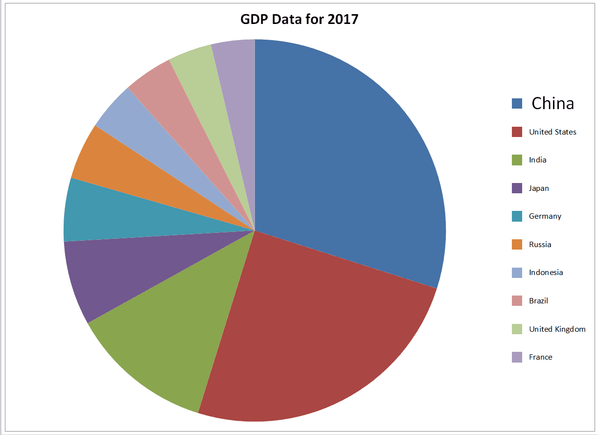
Notice how the first legend entry, China, has a bigger font than the other legend entries.</b>
Axes
You can manipulate the axes through the Axes() method, as well. To modify the axes, you must specify which axis you want to change (category, series, or value), then you can change their properties.
For example, you might want to add labels like this:
Sub add_axes_titles()
Dim oChart As Chart
Set oChart = Charts("GDP Chart Sheet") 'if you don't have a chart with this name,
                                       ' you'll need to add one and name it first.
oChart.ChartType = xlColumnStacked
oChart.Axes(xlCategory).HasTitle = True
oChart.Axes(xlCategory).AxisTitle.Caption = Sheets("GDP Data").Range("A1")

oChart.Axes(xlValue).HasTitle = True
oChart.Axes(xlValue).AxisTitle.Caption = Sheets("GDP Data").Range("B1")

End Sub
This macro adds titles to our chart and then changes the title on the category axis to
Use of xlValue and xlCategory
The reason we use xlValue and xlCategory is due to their representations on the visible charts. From math classes, many of us probably remember the x-axis as the horizontal axis and the y-axis as the vertical one.
However, consider how a xlBarStacked chart differs from an xlColumnStacked chart. In our GDP example, these two chart types swap the x and y axes, but the “values” and “categories” remain static. To see this in action, we can use our handy immediate window. Enter the following line of code in your immediate window and press Enter:
set oChart = Charts(1):oChart.ChartType = xlBarStacked:debug.Print oChart.Axes(xlvalue).AxisTitle.Text:oChart.ChartType = xlColumnStacked:debug.Print oChart.Axes(xlvalue).AxisTitle.TextThis line of debug code is a bit long, but it’s useful. It switches between the two chart types and prints out the text of the “values” axis title. If we had an x/y scheme (with the typical horizontal/vertical orientation), we would have different values (“dollars” and “country”). But if you run this in the immediate window, you’ll end up with
The two charts look like this:
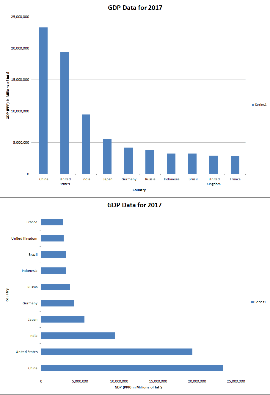
Column on the Top and Bar on the Bottom
Note the change in orientation and axis location
The key takeaway is the xlvalue axis title is the same, even though the two chart orientations differ.
The label “x-axis” is not a magical one, and it might be better to think of axis labels in terms of mapping. The category variable will map (go to) the value variable (category –> value). In other words, we start with the category variable and end up with the value variable. The orientation is irrelevant.
What about scatterplots, which explicitly reference X and Y axes? Well, there is not really a “mapping” relationship and the mapping concept we just introduced won’t really work. For instance, in height versus weight data, we cannot simply use one or the other as the independent, original variable.
For scatter plots, a bit of memorization will suffice: just access the horizontal axis (x) with xlCategory and the vertical axis (y) with xlValue. Thus if you have height data on the horizontal axis, you can use oChart.Axes(xlCategory).AxisTitle.Text = "Height" to label the horizontal axis HasTitle property is set to true first!
Practicality
We’ve really only scratched the surface of chart manipulation in VBA. So far it has been somewhat tedious to write code to do things that could easily be done manually - and perhaps more easily - through the GUI.
So why make charts programmatically at all? Well, using the legends section, one example could be to calculate each entry’s share of the group’s GDP, read off the colors used by Excel in the graph itself, and then color and size the legend entries accordingly. This would take a lot of work to do by hand, but a VBA macro can do this for you in a few milliseconds. Once you spend the time writing the code the first time, you’ll be able to recycle it for future chart manipulations.
If you build up a lot of code with a variety of formats, you could consistently generate presentation-level material very easily each time you had a new set of data. This is particularly useful if your coworker sends you 10 hideous charts and you have an important sales presentation with a client in 30 minutes…
Another possible reason to use VBA for chart generation is if you have large numbers of frequently-changing charts. Imagine a part of your job is to scrape websites for data that change every day, create charts based on the data, then send them off via email. VBA could automate the entire process for you, so you can step away and enjoy your coffee break.
One of the coolest reasons for making charts with Excel VBA is the prospect of making interactive charts. For example, you could pair a chart manipulation macro with a form control listbox macro to change the source data based on a dropdown menu. The possibilities are endless when you start stacking VBA skills like this.
That’s all for this tutorial. When you’re ready to take your VBA to the next level, subscribe using the form below.

